
I am remaking the accented glyphs on Neuton before I finalize other versions... Opinions please.
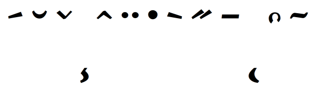
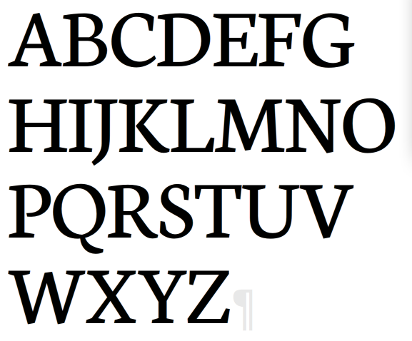
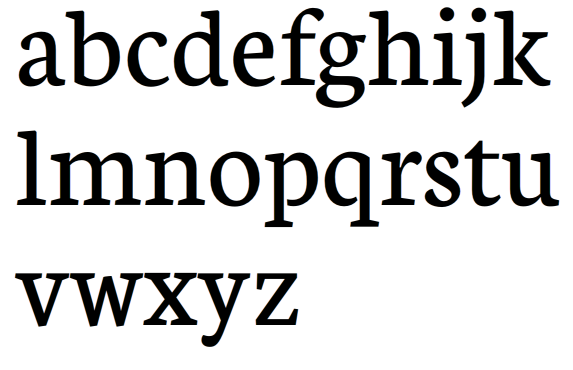
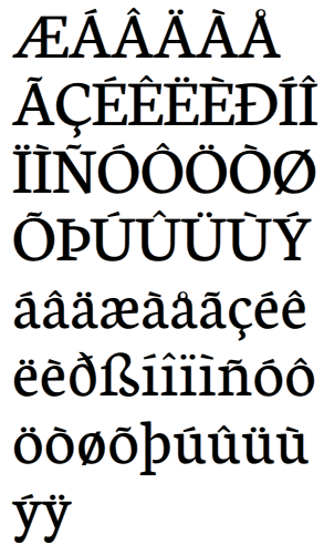
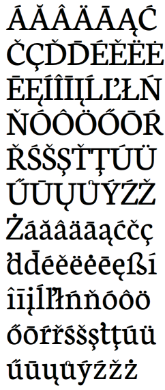
I have all glyphs for Western European, and just need to make the comma below for Central European.
Thanks!
I am remaking the accented glyphs on Neuton before I finalize other versions... Opinions please.
I have all glyphs for Western European, and just need to make the comma below for Central European.
Thanks!

All your accents are very near the letters. A bit more room will increase legibility. The opposite occurs with |i| + accents, with an excessive gap.
|d| + commaccent is inverted. Hungarumlaut will collide in small sizes, you may space it a bit. Armstrong does not works, IMHO. Slash for |O| is not centered. Slash for |o| seems very heavy.
Others accents are OK, especially tilde and cedilla.

Give acute and grave steeper slope so they can more easily be told apart.
Raise lowercase accents to the upper middle of the ascender space.
The ring is supposed to be a circle. Usually it's unstressed or at least evenly stressed. The connected form of Å is a compromise for limited space, and should be avoided if possible. To connect lowercase å is never done. And of course the broken thing on Ů/ů is completely unrecognizable.

Just a few weeks ago I came across this website: http://diacritics.typo.cz/
It's very helpfull for what you're doing right now. One of the things it states is that Polish people won't recognize your grave or acute because they're more horizontal than vertical, so you might change that or make an alternate. The rest has already been said by Freiberger and Cerulean.

Brian, good sources:
ad ogoneks: http://typophile.com/node/66141
ad various diacritics http://diacritics.typo.cz/ (especially Czech and Slovak, look at Lcaron and lcaron, as yours need correction) [edit: Jasper was a bit quicker..., obligatory source]
-dot in zdotabove should be the same as in "ij". It looks strange in word "iż" for example...
Next time pdf?
Captured from commoncrawl.org on 26 Apr 2015. original URL