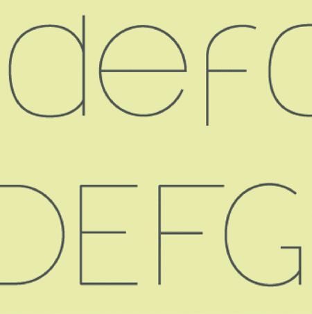
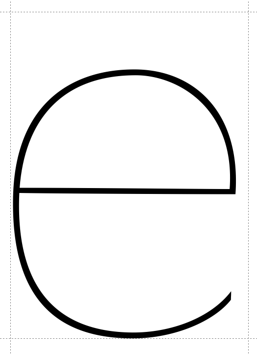
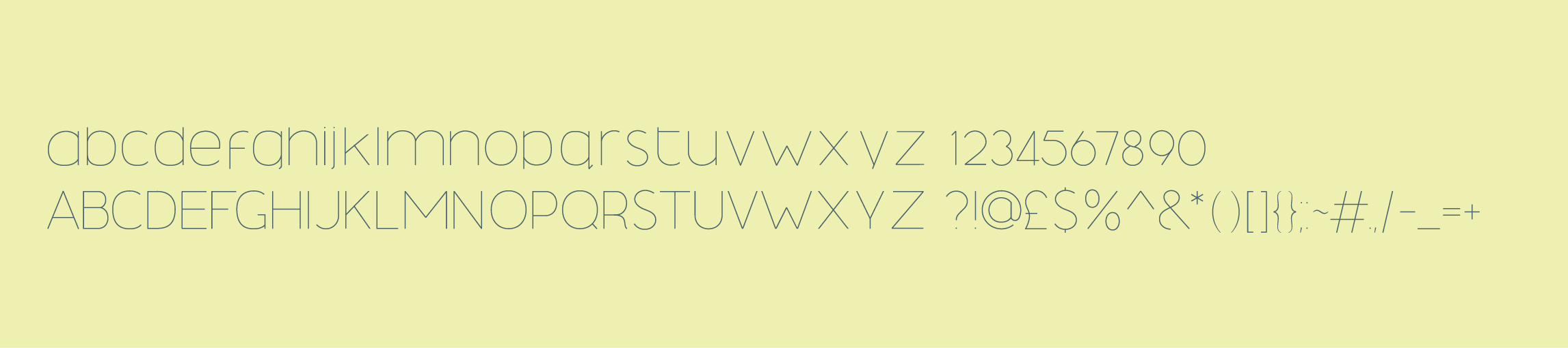
I have absolutely no prior knowledge of typography or type-design, but recently decided to design a typeface of my own.
I know it's not exactly the most complex of designs but I like to think it's relatively original.
I'm not looking for comments on spacing as this hasn't left illustrator yet, just wondered what the type gurus out there thought.
Any name suggestions would also be cool aswell,
Cheers, Elliott
| Attachment | Size |
|---|---|
| example | 40.06 KB |