
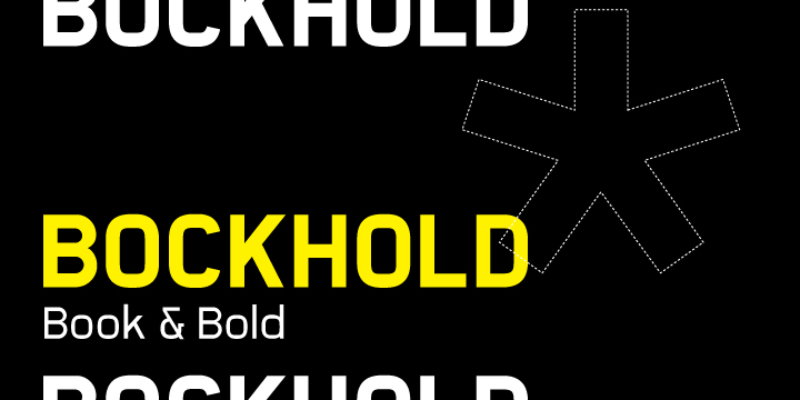
Would love to get feedback on this new face. I made some changes based on comments and have attached a new pdf below...
| Attachment | Size |
|---|---|
| bockhold_v1.0.pdf | 35.34 KB |
Would love to get feedback on this new face. I made some changes based on comments and have attached a new pdf below...
| Attachment | Size |
|---|---|
| bockhold_v1.0.pdf | 35.34 KB |

Can we have any other samples - all that loads for me is just a plain white image!
Sorry, uploaded a new image for ya.

A few thoughts:
/B/ looks too wide.
Tittles could be larger.
I don't think the /k/ works.
Good call on the B, was previously less wide... thanks, regarding the K, is it both lower & upper that you think do not work? and why exactly? Also - tittles? what do you mean?

Hi Richard, welcome to Typophile :)
This looks promising but I'd need a pdf to see up close.
First impressions, this looks rather nice.
Uppercase:
I'd agree the B looks wide, also the PR and S; narrow ones include OQTX and possibly W.
Crossbar of G could be much more confident. J could be a bit wide, N perhaps a bit narrow.
Lowercase
k needs some attention as Craig said.
Curve on f and t could be wider.
Difficult to scroll to the lowercase on this page.
Other
8 looks narrow, 5 looks top-heavy, flag of 1 should be much more definite. Exclamation mark looks light. Octothorp is an unusual floating design? Asciicircumflex is way too high. Ampersand reads like a 3. Braces are out of character.
"tittles" are the dots on top of /i/, /j/.
I mean the lowercase /k/, which just looks too unconventional with the arm launching from so low on the stem. (By the way, I would think a font with this "mechanical" style might look good with a /k/ that connects with a horizontal line. Something like this.)
Bendy, thanks so much for your time w/ the notes. I will look into and consider all comments.& post any revisions, as i go...
Eliason, thanks, really appreciate it. Will keep playing w/ the k, see what happens.

Looks good, but I'm not sure if it's 'different' enough. I agree with eliason about the i j and k. Here's what I see:
K is top heavy
B is top heavy and too wide
G should be simpler
J is too wide
s is top heavy
m n u h are too wide
x is too small
Z is top heavy
I think you need to redefine the width of a lot of the caps. With my expletus, I had the same problem. For me, Frutiger worked really well to help me do that.
IMO the common mistake with geometrical typefaces like this is that they are too much based on geometry, ignoring the optical illusions. For example, the middle horizontal stroke in the B is exactly in the middle, but it looks like it's underneath the middle, which doesn't add to that geometrical feeling. Look carefully at all glyphs with a blank mind, forget about the numbers, trust your eye and change accordingly.
I hope this helps. I'm not a professional so feel free to disagree.
BTW: I love your lettering for Shane Co. You should make a typeface out of that.
1996type, I hear you about looking at everything optically, it's great to have all this feedback, and will only lead to making this a better face in the end. Oh and glad you dig the shane type recut, it was for a jewelry franchise in the US... i cleaned up their existing design from the 1950's...
Thanks for the better image.
I think everyone else covered just about all that I can see, plus some other details.
The /at/, /exclamation/, /parentheses/, /curly brackets/,slash on the /$/, /percent/, and the /i/j/ dots all look too light to me. Also, /at/,/parentheses/, and /curly brackets/ look like they belong to a different font.
After you can consider all the recommendations and post some new samples, I'm sure we can give a few more tips, although all that's left is final tweaks regardless.
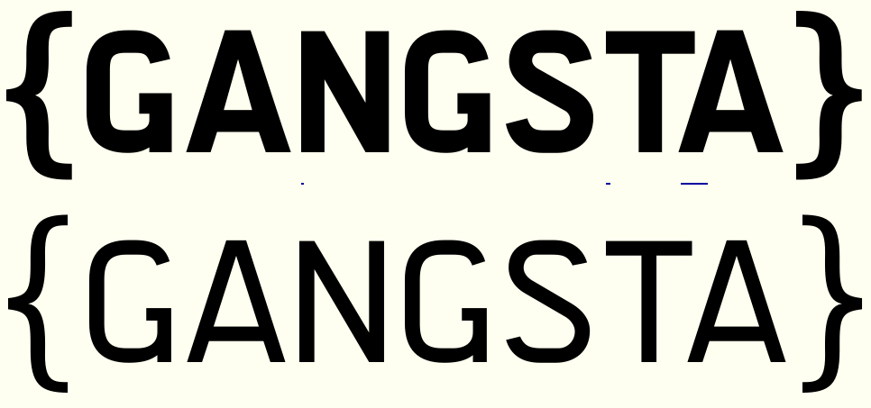
Thanks Brian, regarding the { } and @, agreed, they do feel disconnected, I get that, but I don't want it to feel too mechanical, this adds some warmth/human hand and whimsy into the mix.
ok ok, i'll admit... i tweaked the { } and it's does feel better... moving on to the rest, thanks all
.

I think you should increase the overshoots slightly, especially on the top of round numbers (2, 6, 8 and 9). I know a lot of people don't like overshoots on squarish fonts, but to me your rounder letters look too short. It makes D hard to decide what to do with though!. Curve on bottom of g should be squarer like the curves in the rest of the font. I'd also consider a tail on lower case l.

To my eye, the lowercase seems narrower than the caps, overall.
Also, in the boldface, you need a bit more optical compensation (narrowing) at the joins of curves to straights. It's ~ right in the regular weight, but you could do a little more in the bold.
Cheers,
T
Captured from commoncrawl.org on 26 Apr 2015. original URL