Typophile

Typographic quote - meanings

msk14x

I've been looking at typographic quotes, some from the forums on here, and just wondered if anyone could expand on the meaning of the one that attracted me the most?

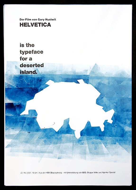
"Helvetica is the typeface for a deserted island" - Friedrich Friedl

I'm asking just so I can get my head around the understanding of the quote, would be great if anyone could emphasise the meaning of this to me!

Thanks

It’s a clever quote and works on two levels:

1. Friedl compliments Helvetica by suggesting that if one were to be cast away on a desert island (à la the BBC’s Desert Island Discs program) and could choose only one typeface, Helvetica would be the one; and

2. Friedl also hints that Helvetica itself should be banished to a desert island.

That’s the way I interpret the quote. I could be making s*** up in my head. It happens.

Close. Friedl was actually commenting on the opening typography for the TV show Lost.

The participants of our letterpress workshop thought that Helvetia was the island:


Source: jpetri.de | Making-of: Flickr

on a deserted island, no one can hear you scream.

-bowerbird

But if you scream and nobody's there to hear it, does it sound like Helvetica?

Captured from web.archive.org on 24 Aug 2013. view this capture