
Cheers,
I am looking for good examples of slanted wordmarks. I am working on one, and though I know, this "effect" is not new, I'd like to see how others have interpreted it.
Thanks a lot!
-pop
Cheers,
I am looking for good examples of slanted wordmarks. I am working on one, and though I know, this "effect" is not new, I'd like to see how others have interpreted it.
Thanks a lot!
-pop

I made this for a directory service:

When you say "slanted" are you referring to italic type, or to the type baseline being on a slant?
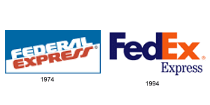
Perhaps the old Federal Express' logo is the kind of thing you're thinking of. I did some design work for Federal Express back when they were using the old logo and one problem we often had was that the slant made the entire logo look crooked even when the bounding box was perfectly straight.
James, I see your point.
I was thinking of something like this.

Beer logos come to mind. Here are a few:
http://www.couchdistributing.com/images/beerLogos.jpg
http://www.funbeverage.com/images/beer_logos.gif
Are you thinking something more clean and corporate?
Yes, clean and corporate, linked to technology and premium segment. Something one could imagine to see on 5th Ave. or Bond Street (I am as serious here as one could possibly be... )
Captured from web.archive.org on 14 Oct 2013. view this capture


