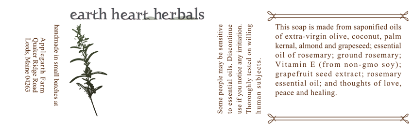
I'm designing labels for a line of soaps. One woman makes the soap, uses a lot of organic and natural ingredients. She was using clip art before this. I'm doing this freelance and I've really only had a couple design jobs before, so feel free to tear it apart. Just looking for a general critique. Thanks:
[Bad link]
[Bad link]
[Bad link]
[Bad link]
[Bad link]
[Bad link]