Hello people, how are we?
I am working on a logo for a sportswear company I am starting up.
The company name is fourmation, I did want to use the company name formation but couldn't. I then justified calling it fourmation because of the numbers used for formations in sport etc...drill me if I need drilling haha.
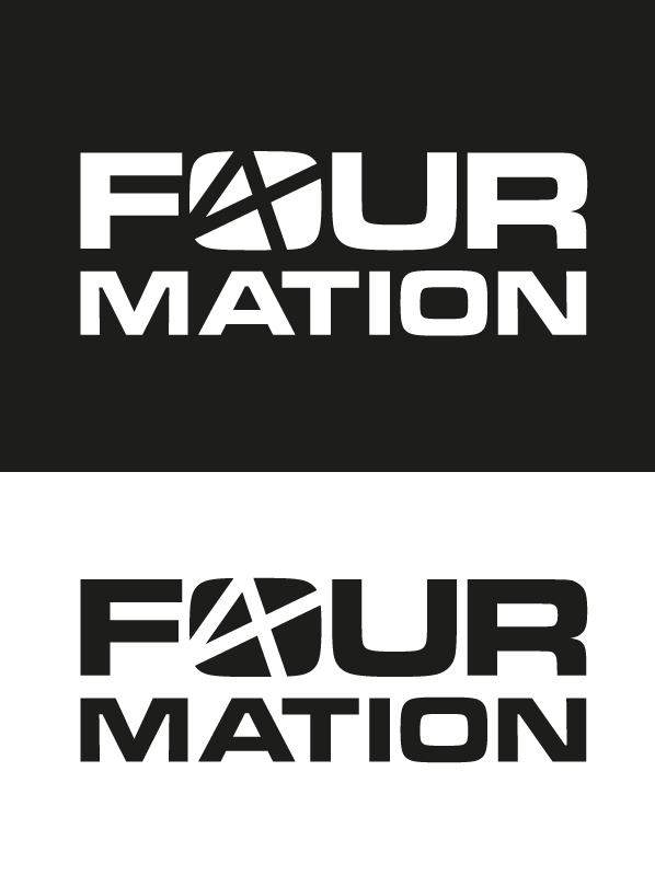
First option:
I decided that because its a logo going on sportswear that in needs to be simple, effective and work in one colour only. Attached is a concept that stood out for me, the word fourmation will appear below it. I wanted the logo to refer to the number four somehow but not in a cliche way...I am sure we call all dream up something in no time using the number 4, I didn't want it to be that easy.
As you can see in the logo there is both a "f" and a "4", I need to know if this is obvious enough to work? I am worried that the 4 doesn't look convincing enough, am I right?
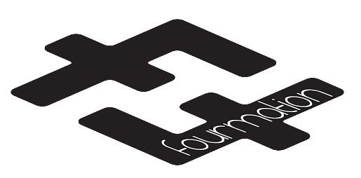
Second option:
I have showen this logo to a few people and they love it, out off all the concepts I have showen them they seem to go straight to this one? Does anyone else here like it? I personally are very unsure
Please help!!!