Hello Fellow Typophiles,
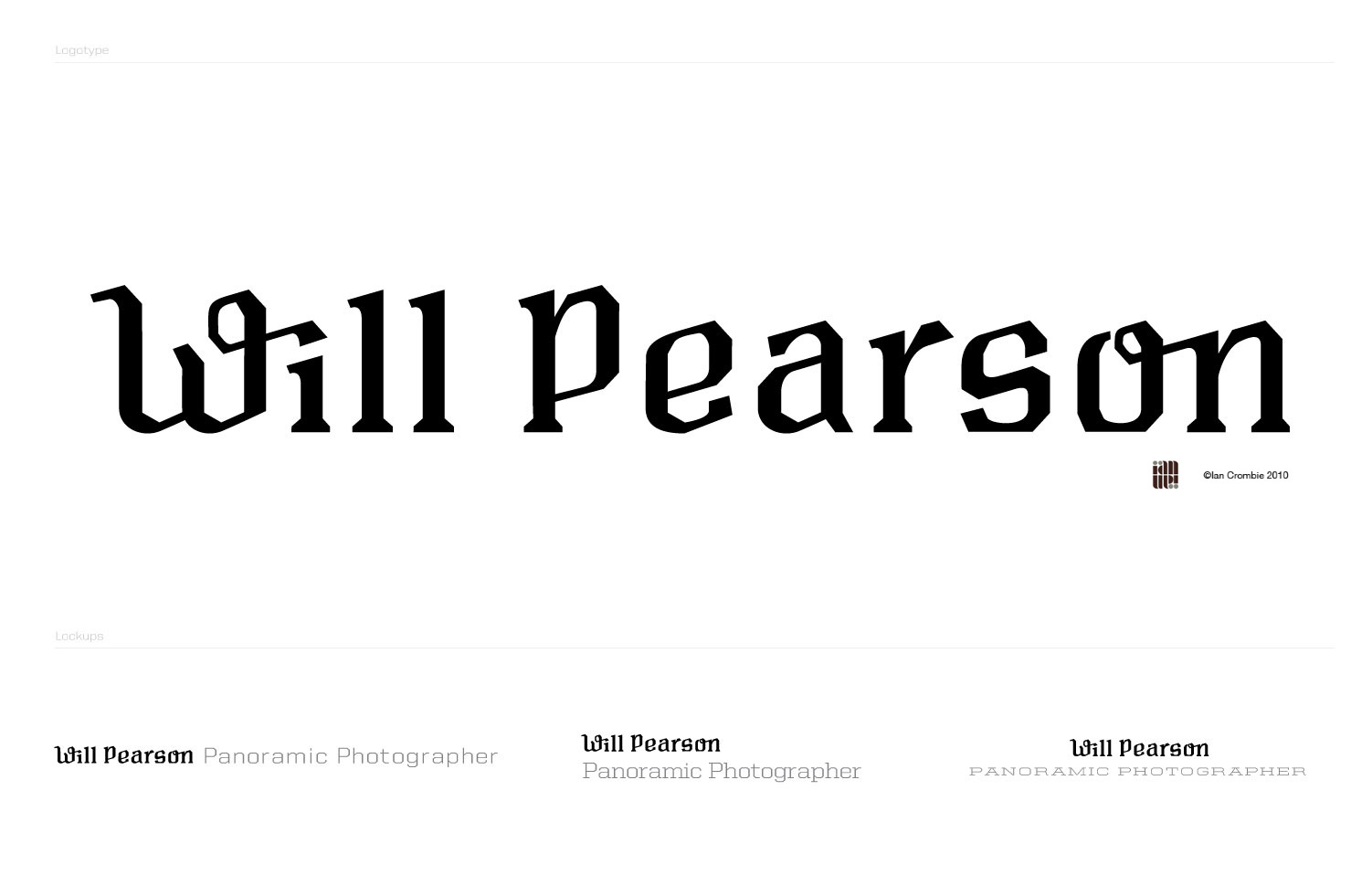
I was contacted by a photographer to create a custom logotype for him. He had seen an identity I did for another photographer and said that those letterforms resonated with him, and he would like something similar. Will is a very talented panoramic photographer and after perusing his personal website I decided that this logotype needed to be wide. I also wanted his logotype to work nicely with a complementary typeface so that I could write:
"WILL PEARSON PANORAMIC PHOTOGRAPHER"
all in one line, to create a panorama of sorts. [See WillPearson_LogoType_01.jpg for example ]
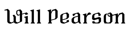
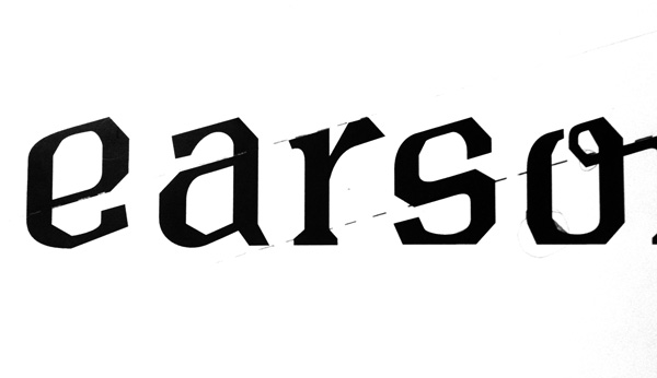
The type has a few systems that I feel describe the technical nature of his photography. There is one major angle, that is repeated at the top of all the letterforms, it also runs through some of the letters to create a tight relationship between the letters (i.e: the bottom of the e's eye, moves to the top of the a's bowl to the top of the r's stem) [see attached Sketch01.jpg] There is a play between sharp angles and curves. If one side of the letter is sharp the other is smooth. The ligatures/swashes add a little bit of a human quirk to what is an otherwise rigid logotype.
I'm in the early phases of refining, and I have some things that are troubling me that I would love your thoughts on.
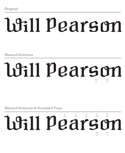
- The bottom of the e, its angle is slightly different than the 'main angle' as it is the same angle as the bottom of the a's bowl
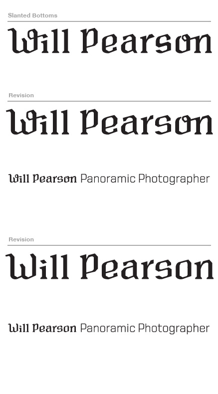
- The s & o have flat bottoms, unlike the e, see attached sketch [Sketch02.jpg] is this a good idea or would flattening the e's bottom be better?
-for the e, s, and o, the outer upper left side is smooth, and inside is straight. Do you think the opposite of this as seen in [Sketch02.jpg] is a good idea?
any thoughts or comments would be greatly appreciated, I've also attached a larger image for critique.
-Ian
| Attachment | Size |
|---|---|
| Sketch01.jpg | 23.12 KB |
| Sketch02.jpg | 32.28 KB |
| WillPearson_LogoType_01.jpg | 73.71 KB |