
thought it was interesting that a san serif, and such a blocky one was chosen for a statue erected in the mid 19th century.... anyone know any fonts it looks like its based on ? the x height is throwing me off...
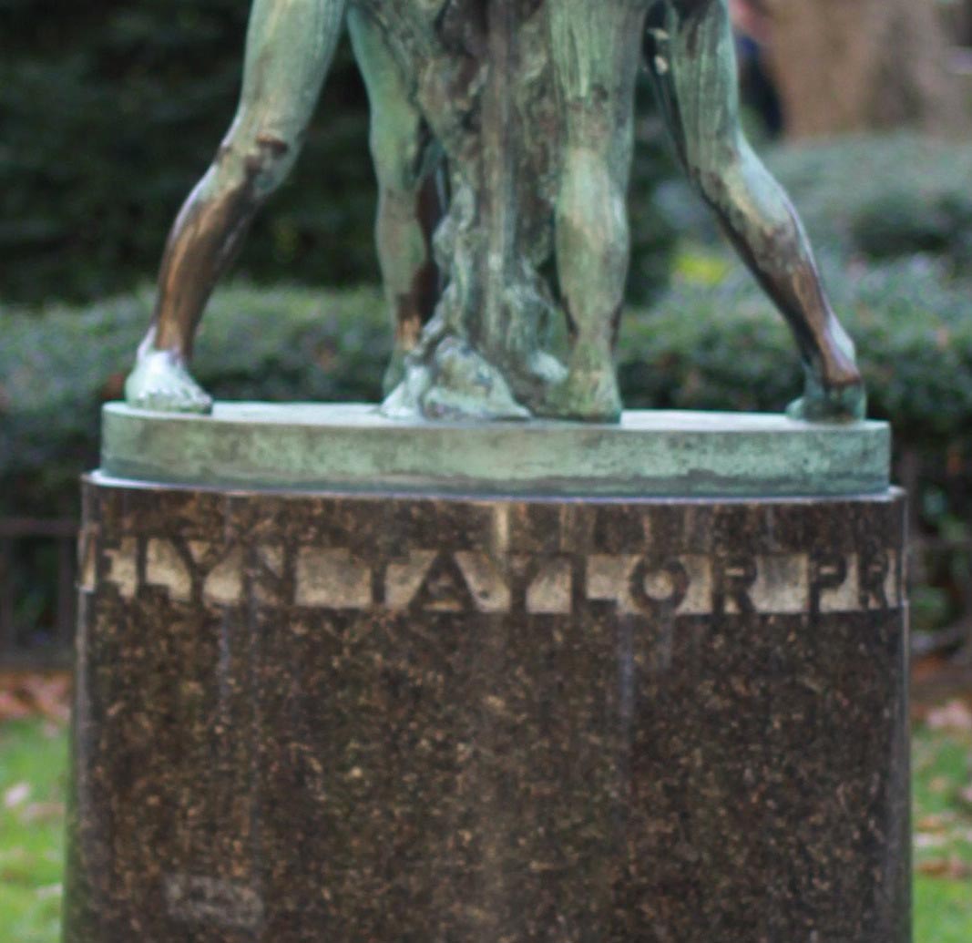
thought it was interesting that a san serif, and such a blocky one was chosen for a statue erected in the mid 19th century.... anyone know any fonts it looks like its based on ? the x height is throwing me off...

Similar to...
http://new.myfonts.com/fonts/nicksfonts/cerulean-nf/regular/characters.html
a.k.a. Lining Gothic No. 7.

Oldnick is right on the spot. If you like this you might wanna take a look at the Dutch type called 'Nobel' too.
Captured from commoncrawl.org on 27 Apr 2015. original URL