Typophile

ataxia: new font from justi

Good evening!
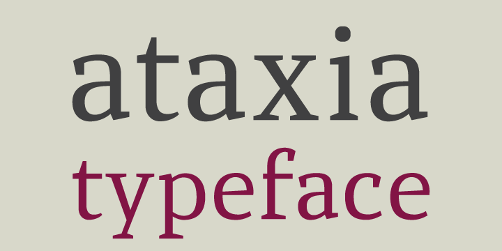
I am pleased to announce my new font, called Ataxia. I would like to hear opinions about the project!

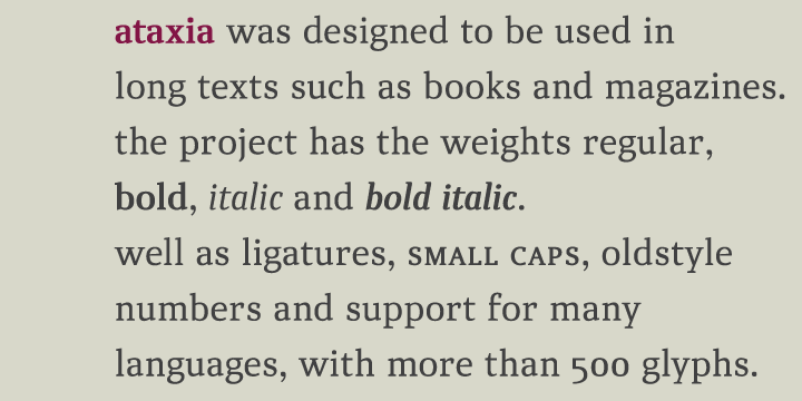
Ataxia was designed to be used in long texts such as books and magazines.
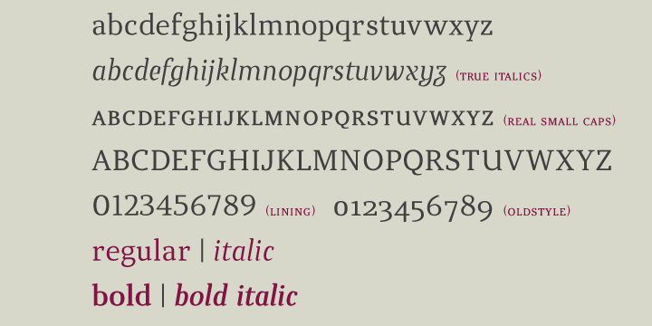
The font has the weights regular, bold, italic and bold italic as well as ligatures, small caps, oldstyle numbers and support for many languages, with more than 500 glyphs.

http://new.myfonts.com/fonts/danieljusti/ataxia/


Nice :-)
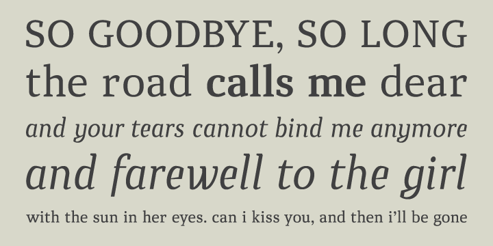
Interesting angular italic.

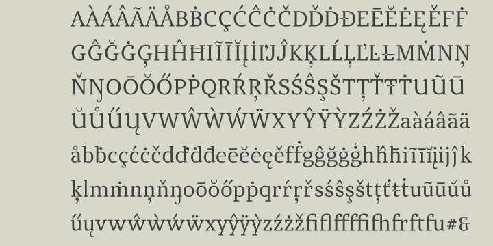
maybe you should merge all contours - have a look to your last picture. Eth, Lslash, Tbar, tbar

thanks, riccardo!

andreas, the contours are merged. maybe something wrong occurred when I generate the previews.

any other opinion?

Make sure to "set PS direction" before merging.

**
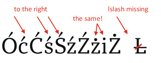
There are several problems with the accents.
Check out the Diacritics web site to get them right.
http://diacritics.typo.cz/

Thanks Nick, that's some really interesting reading!

I like your xyz, justi. Smooth and inviting, like ice cream.

This face is **** great. :)

It would be nice to see it expanded into more weights and get some discretionary ligatures in there.

I love the italics, too. Very quirky, but fit well with the overall aesthetic. Great work.

Some issues:


Looks very good in small sizes, so for sure deserves some polishing.
best of luck!

Thanks for the comments!

Nick and JanekZ: I'll make this corrections to, in the future, release a new version. Thanks a lot!

And thank you again, Nick for indicate the Diacritics website, will be very usefull to me!

All the best

Daniel, as I already said in Critique section, Ataxia is a beautiful and very clear font. I like it and think you will have a great product after these corrections. I also loved you rainy photos (taken in Sampa, I suppose).

Captured from commoncrawl.org on 26 Apr 2015. original URL