Hi,
I'm Giuseppe Salerno, Art Director of Resistenza.es -Valencia Spain.
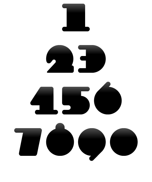
I'm developing some fonts, and i would like you to see my latest
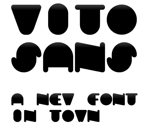
creation called Vito Sans.
http://www.resistenza.es/vitosans/
this typeface born during the summer of 2010, in a little town
called San Vito lo Capo in Sicily.
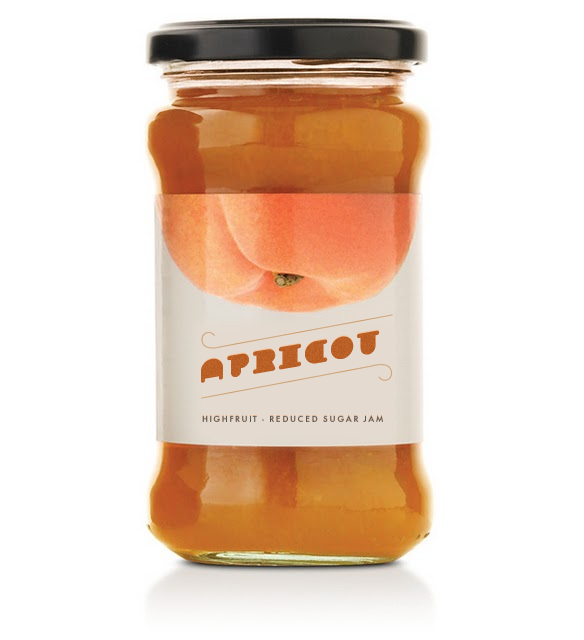
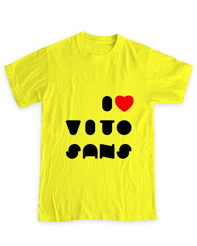
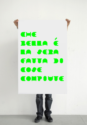
this uppercase font is perfect for when you want to use eye-catching
big texts for anything from posters and flyers for concerts, events,
parties, to cd covers, advertisements.

I hope you like like it!
thanks for your time.
| Attachment | Size |
|---|---|
| vitosans_big.png | 16.23 KB |
| accent.png | 10.04 KB |
| apricot.png | 190.07 KB |
| tee1.png | 254.37 KB |
| poster.jpg | 97.47 KB |
| numbers.png | 13.55 KB |
| vitosans-presentation.pdf | 481.88 KB |