
I've got four words here that could use some critique!
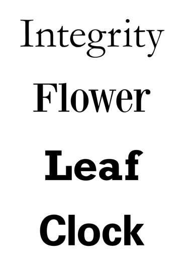
I've got four words here that could use some critique!
Your image is 3300 pixels wide!(EDIT. I see you reduced it a bit while I was writing this.)

Too much space between a & f in "Leaf".
If you see any adjustments that need to be made please let me know! Thanks
Captured from web.archive.org on 23 Apr 2015. view this capture