Typophile

Provisionally titled Rollerscript until I can think of a better name!

Nick Cooke

This is something I am working on at the moment

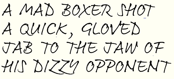
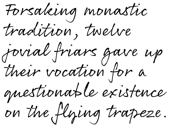
After my last script Olicana, written with a steel nib and ink, I thought I'd go more up-to-date with a Ball Pentel, but still with the mostly connected feel. I hope to achieve the authentic handwritten look of Olicana with this one, implementing lots of ligatures and some contextual alternates for certain characters. Or I might have individual characters as stylistic sets so that one or more characters may be substituted. I shall probably have Rough and Smooth styles also.

I am not sure about keeping the 'lumpy' bits in the smooth style or smoothing them out.
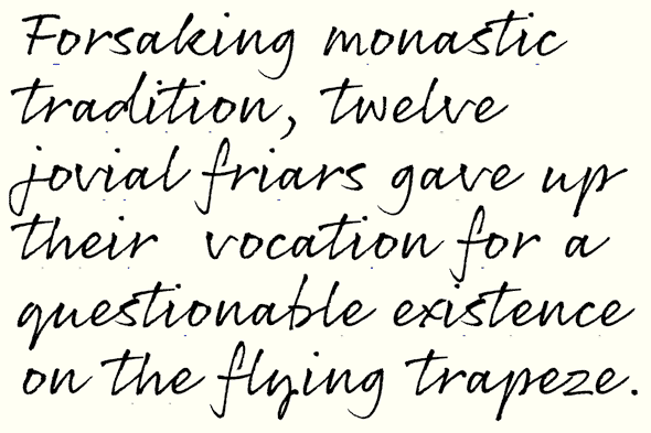
Alright Nick, step back from the ledge! HA... handwriting anonymous could be of some help :-)Go for it... it has great potential.

I like the lumpy bits!

Michael

The caps look great!

This is amazing, Nick!

I like the lumpy bits!

Me too!

I like the lumpy bits!

Thirdied.

I think your Olicana is really great, because it's so distinctive. It has masculine strength and a lot of energy, which is very unusual with cursive scripts. This has it too, go for it!

the "lumpy" weight takes it away -- this is ace.

Thanks everybody, I've been adding stuff. An update coming soon.

Like your occupation Don.

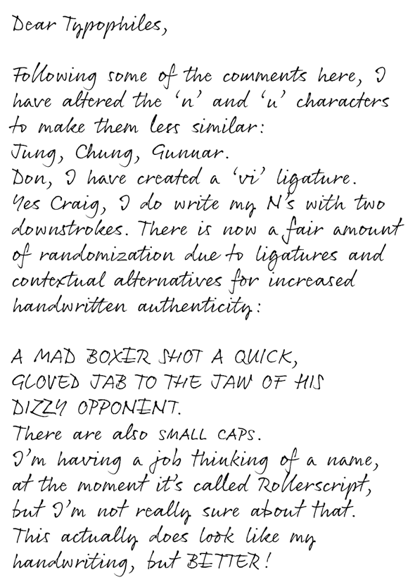
Here's an updated sample with some ligatures and contextual alternates:

beautiful -- a question/suggestion: how about a "vi" ligature? when i happen to write it, i never lift the pen.

I feel the N is unclear. The right side sweeps up and then down again, which gives me the impression of a sloppy M.

I can't see that at all - it looks like an N to me, especially in the context of a word. I don't read OPPOMEMT.

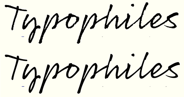
The similarity of the 'u' and 'n' glyphs might be a problem. I've had a client reject the use of FF Market because of this. Names can be especially problematic.

"Jung", "Chung" and "Gunnar" in FF Market:

FWIW, I can kind of see the M/N potential confusion.
When you write an N quickly, do you write the two verticals with downstrokes? I write a downstroke, then the diagonal down and the second vertical up.

I don't see any problem with the N. The new version feels a little less lively, but I have no idea why.

Please do an alternate ‘N’. Everything else is so nice.

R, the latest mystery person to chime in about the N. So I've altered it.

I think I figured out the difference in my impression of some of the posts as more lively than others. The bigger ones show the roughness more, and that adds a bit of drama. In any case, wonderful work!

Thanks William, - Yes, it's quite surprising, as it really is pretty rough, but hardly noticeable at small sizes.

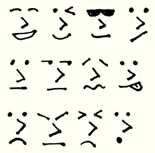
I think some dingbats would be useful - arrows, smiley/frowny faces, a heart, etc.
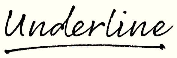
It'd be cool if you could work out a way to get an in-character underline of words as a possibility, but I suppose anything varying from pure horizontal would be tricky if not impossible...?

Oh, and I like the new N :-)

Thanks Craig. I figured out how to do crossings out for Olicana, so underlines should be similar in principle, except lower. Horizontal would be OK, but a slight upward angle from left to right might be better.

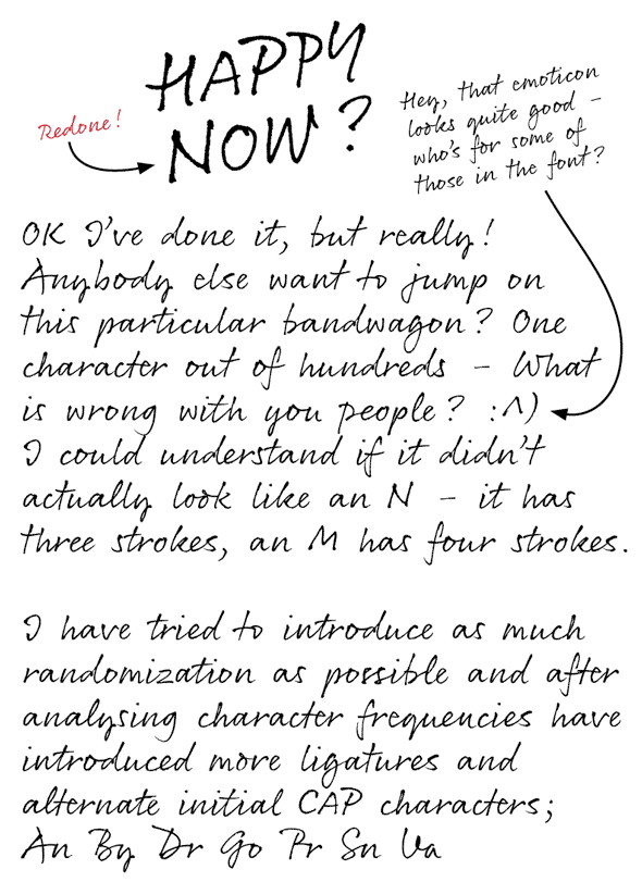
I was thinking of including emoticons, arrows in different directions, stars, moons, suns, hearts etc, (even though they're a bit 'girly' for my liking) - I'm not being sexist here, it's just that I'm a bloke from Northern England, (although not particularly macho - I'm a type designer after all) ;^)

Happy now :^)

nick, you've cooked up (being a lawyer, i am entitled to lame puns -- sue me.) something wonderfully edgy there -- but i'm sure you don't need me to tell you that. top notch, and i appreciate the ligature (note that i didn't complain about the n and m! haha).

How did you do the crossings in Oliciana, Nick?

Nice one, Nick-

For me, with Suomi Hand, the hardest part was where to stop with the ligatures. Good luck. :·)

Nice emoticon!
I second the idea of the underline. Maybe it could be useful to style-link it to italic?

style-link it to italic

Huh? What does that even mean? It's just one style - it won't be style-linked to anything.

Glad you're all liking it so far.

Tomi - I had that problem with Olicana, but with this one I've used liga and calt combined to give more variety without doing so many ligs (even though there are still lots).

Frode - here is your tutorial for the day:

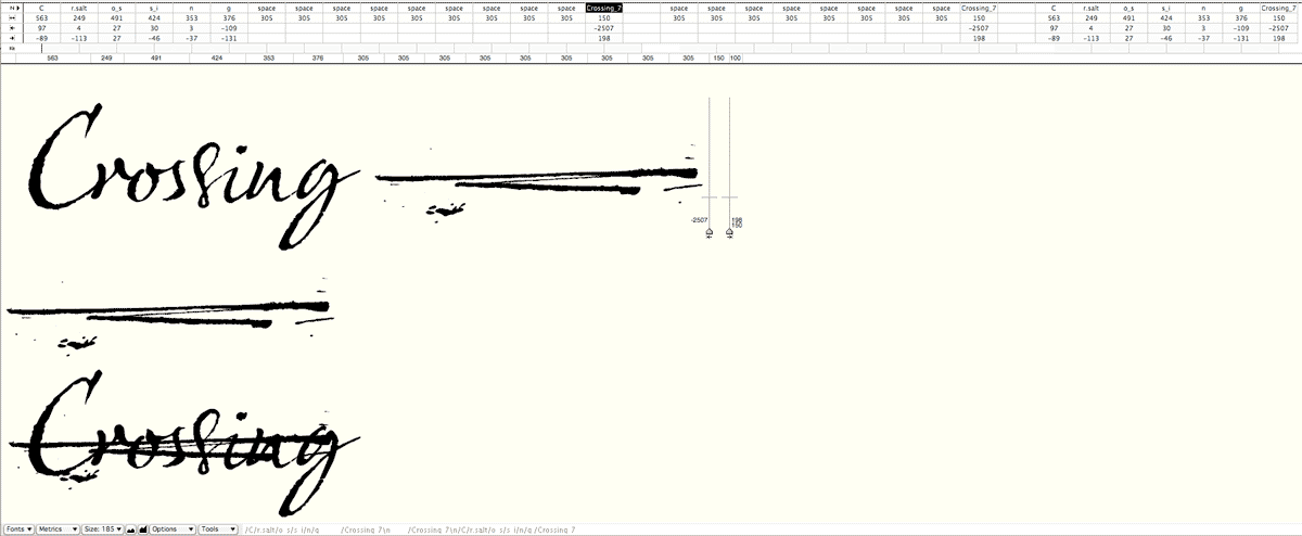
The crossings out were done by having crossings out in 8 lengths from short to long. Each of these is then placed to the left of the left side bearing in the glyph window, thus placing it over the previously typed characters. The width of the crossing glyph is set quite narrow - (198 in this case) so that it can be selected if need be. You can see in the picture how many spaces are needed to make the Crossing_7 glyph appear after the word. The Crossing_7 glyph is selected in the picture and you can see the width is narrow and the glyph itself is to the left.

I hope that is clear enough - it may become clearer if you study the metrics.

style-link it to italic

Huh? What does that even mean? It's just one style - it won't be style-linked to anything.

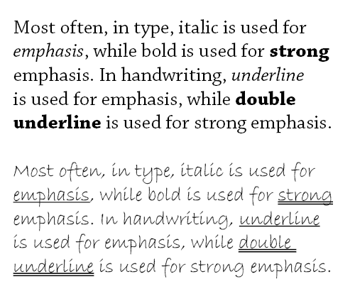
I meant, since in handwriting underline is used for emphasis, in a similar manner as italic is used setting roman text, it could have been nice to have the style link, so to make it easier working with existing text.
One example using generic serif and script fonts:

Oh, I see. Er.... I wouldn't know how to do that, especially with drawn lines of differing lengths. I tried selecting a word in InDesign and clicking underline, but it just looks like your Bradley Hand example; ie. a straight line, not 'wobbly hand-drawn'.

I tried selecting a word in InDesign and clicking underline, but it just looks like […] a straight line

Yes, I know. I don’t know if it’s possible to style-link to underline (and certainly it isn’t with double underline). That’s why I suggested italic, even if it isn’t philologically correct (but, to some degree, semantically it is).

Nope, still don't understand.

(Happy Now.)

You could achieve what riccard0 is thinking of by making a copy of the font that underlines every word (there should be a number of ways to do this with contextual alternates and get a natural look to the underlines) and calling it the italic font. But I'm not sure if that's really the most practical solution for users wanting to add underlines.

Hmmm... I'm pretty sure that wouldn't be the best use of my time. I'll probably do the underlines as detailed above for the crossing out. It's not something I'm overly concerned about anyway, it's just a little extra add-on.

I think you're right. But it would be cool to trigger it with a simple feature that interprets _this_ which is a common computer shorthand.

I've done lengths from 1 to 9 available from the glyphs palette.

the last sample looks very much like graffiti. nice.

I still like your original N best ;-)

Grrrrrrrr!

Nick, it is your font and your handwriting; do it your way ;-)

Wow, you're on fire, Nick. Get in!

For me, the more roughness you have, the more obvious the repetition when it occurs. This is clearly mitigated by an increase in ligatures and contextuals.

Enjoy tobogganning in Wharfedale!

I have now added some emoticons:

Nick, I'm a wimp - I can't stay out there too long, I don't think it has ever been colder here.

Edit. Chris, I have redone the N as I have discovered from past experience that if there is a perceived 'problem' with a character potential customers may use another typeface or even worse do their own alterations. I have see quite a few really bad replacement 'r's of one of my other scripts - Gizmo. (Soon to be remedied and given the whole OT treatment as Gizmo Pro).

Nick: I am sure you made the proper business decision, I know the feeling well.

Great work Nick!

This is great, Nick. It really captures an authentic feel to handlettering which is not easily achieved with a font.

I personally did not have a problem with the previous "n" and "u". They each had the correct arch, it was simply a bit more subtle. Given context combined with even subtle clues I think the average reader would not have trouble with legibility.

My thoughts exactly Stephen, (and thanks), but you know, some people are just so damn picky about the smallest details...

Nick: How do you create the "rought" effect?

Sure Pablo, I'll reveal my secrets to you. Writing at normal hand witing size with a Ball Pentel Fine Point R50, scanning at 300%, 300dpi. Place in Illustrator then LiveTrace on the 'Lettering' setting. I then scaled to about 1300%, copied, then pasted into the glyph window in FontLab then optimized, (clean up paths really).

So, it's not an 'effect' in reality - that's just how it is.

This is brilliant, the underline and strikethrough really top it off :)

It's just the underline, there is no strikethrough - that example is from another font.

In Britain many people (who can't write properly) have a problem with the more cursive style of r and z. One of my previous script fonts Gizmo had cursive style r and z as default, and I get enraged every time I see a really bad botch 'alteration' of these two characters. So I have made a more 'standard' style as default.

I have now created a style set of an alternate cursive style r and z (and related diacritics, ligatures), for people who can write properly and recognize the characters for what they are. Is this a good idea?

That lower form of /r/ works far better when the previous letter leads into it from below (Lower "Bright" looks like "Beight" and "Arrange" like "Aerange" to me.) Meanwhile the lower form of /z/ works far better when there isn't a lead-in.
I think the set-up of the cursive letters as alternates makes good sense.

It's strange how people perceive things differently Craig - I see Bright and Arrange, I don't see e's at all. Besides, that's how I would (do) write, I wouldn't lead in from the bottom after an A or B.

I don't know if I see e, but it doesn't flow so well for me, too. Maybe it's because I was taught that, even if it follow an high exit stroke (such as o or f), the enter stroke of r will always be bending like a smile and not like a frown.

Great Nick, it will be a very useful typeface. Which would have been very difficult to produce in lead. :)

It's strange how people perceive things differently Craig
I think it’s mostly just a matter of models. The "British people (who can't write properly)" are accustomed to a form more related to the corsiva Cancelleresca, unconnected, while the two connected forms (especially the "descending" z) are common in calligraphic styles which are not constantly used. You are right, however, by saying that this is due to a lack of culture, and history of our alphabet.
I think the observation riccard0 made is more related to how [A] connects to the subsequent lowercase letters. The stroke makes a curve, and this looks strange. I think [A] does not need so much ligatures, which are otherwise neat with [B] or other capital letters.
About the [N]: keep both forms, one as alternate.

Evidently I couldn't.

Rollerscript Rough and Smooth are now released exclusively on my BRAND NEW WEBSITE! That's right! I'm shouting about it!

You can find them here.

Not only that, but they also have a 25% discount for the whole of February along with every other G-Type font, many of which have been updated/extended/improved to OpenType.

Congrats and good luck, Nick. Looks like a winner.

Captured from web.archive.org on 23 Mar 2015. view this capture