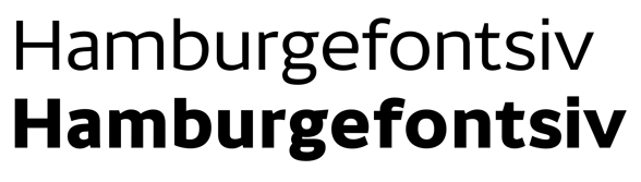
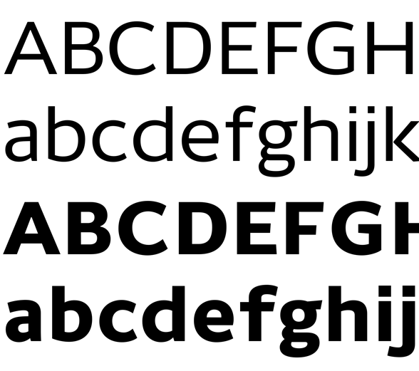
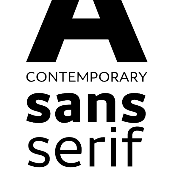
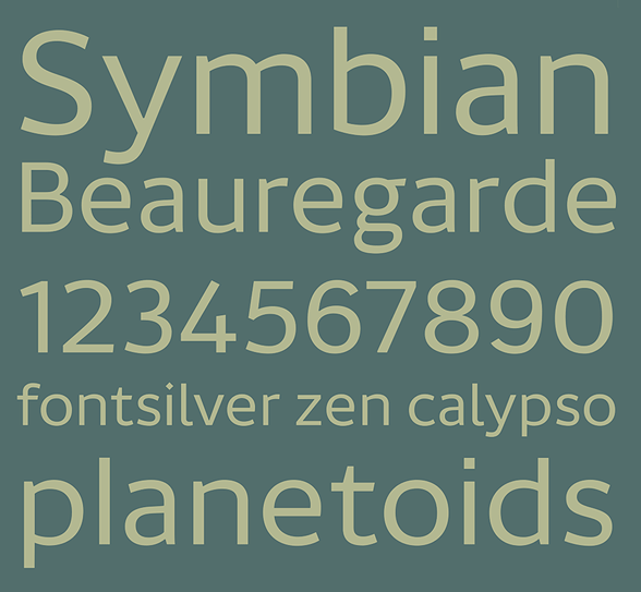
Carnet is a new take on the classic British humanist sans, drawing inspiration from public signage faces as Gill Sans and the UK's ubiquitous Transport medium.
With rather wide proportions and pragmatic architecture, Carnet expresses a feeling of openness and approachability. At the same time, it sparkles with sophistication.
Its clarity of form makes it perfect for public signage and transportation uses. It performs well at text sizes (especially suitable for brochures, instructions and presenting information) and is also appropriate for corporate identity projects.
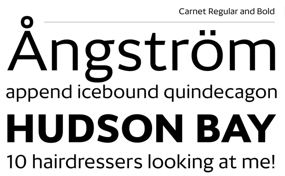
All comments and crit very welcome.
| Attachment | Size |
|---|---|
| Carnet Sampler.pdf | 511.56 KB |
| Carnet Sampler 2.pdf | 548.22 KB |