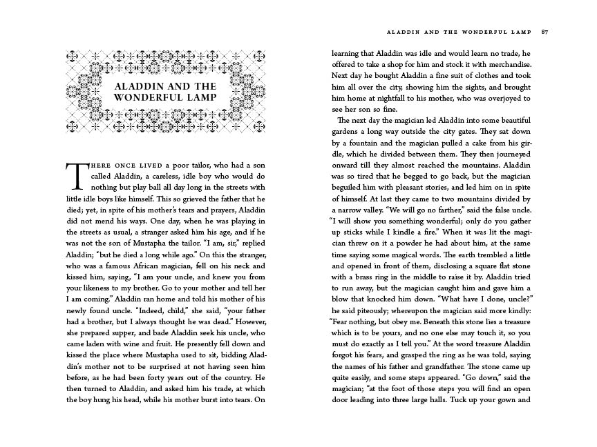
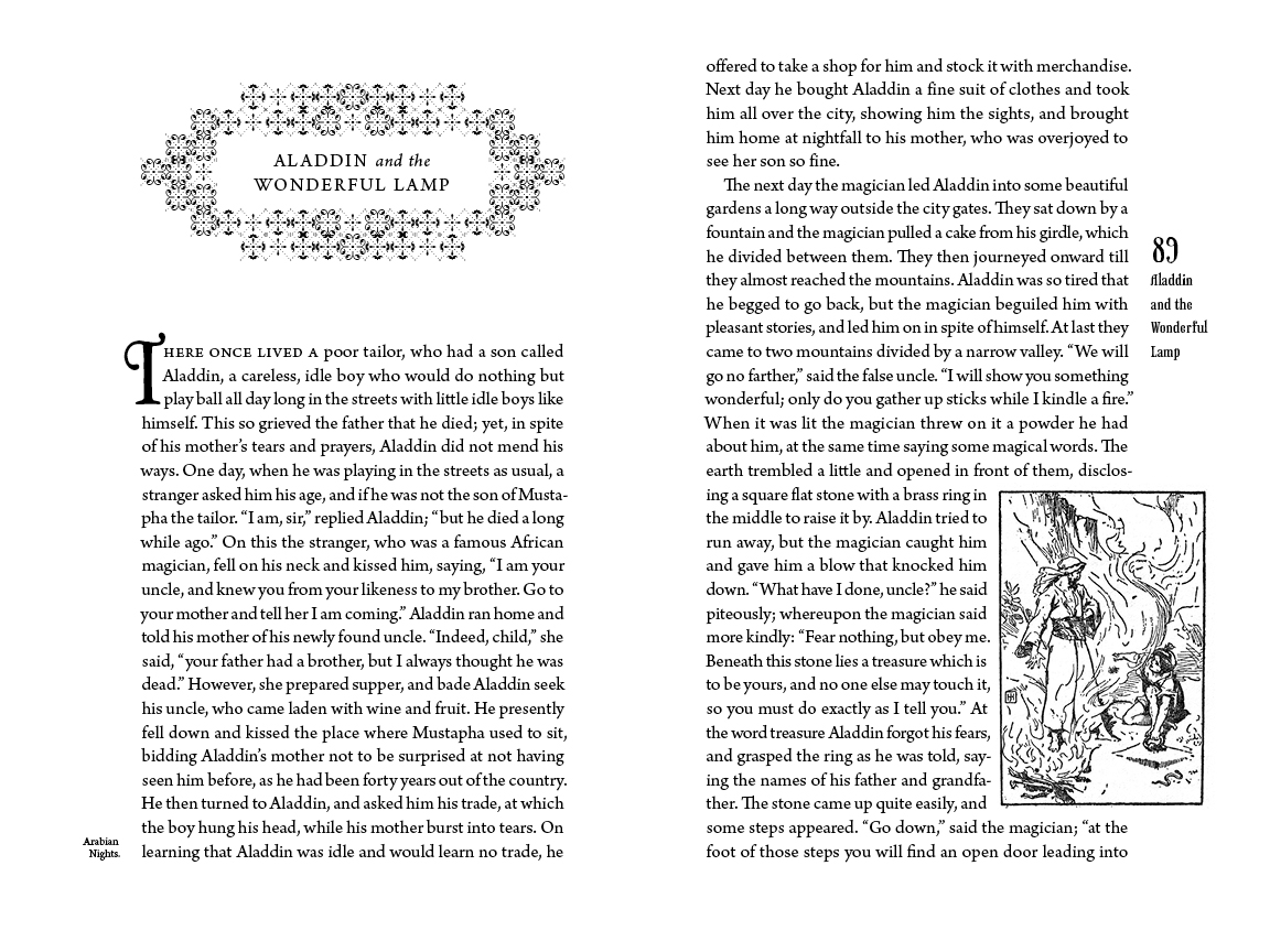
I would really, REALLY appreciate any insight you are willing to dish out. I'm attempting to put together a book of fairy tales. It's the first time I've done something on this scale, and I'm not sure if what I've put together is working or not. The book will be 6 x 9 inches. The type is Arno, 13/16.2 (the weird baseline is simply so the grid would fit the page exactly), with occasional bits of Phaeton (title page, cover, and page numbers, basically). Oh, and I'm using fleurons or whatever they're called from several different fonts for the story title decorations. Thanks so much for helping out a struggling-to-learn flunky.
BEH