
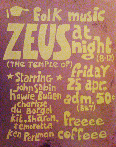
Here's a poster I did for a coffeehouse in college, some decades ago. Completely untrained in typography, I invented my letterforms (and sometimes my spelling) on the fly as I hand-cut the silkscreen stencil.
And here's a logo I made about a month ago for a coffeehouse at my church. The lettering is a hand-drawn (in Illustrator) adaptation of Ed Benguiat's Interlock font.
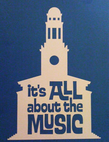
When I looked at it, I realized that my idea of coffeehouse typography hasn't changed much in the decades since college!


