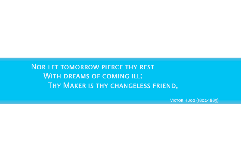
It's my first time in this forum and I'd like to thank you all beforehand for your collaboration. I'm involved in an art commission project for a hospital that involves type. The design concept propose to use poems in the corridors of the emergency area. It's an environmental graphic design project and excuse me if I'm not in the right forum.
I have done some research to find a typeface that will suit the project. So far, the chosen font is PraxisEF Small Caps, which I believe, it works quite well. It looks quite formal yet friendly and not as industrial as, for instance Helvetica. We decided on Small Caps because they reduce visual noise as they don't have ascenders and descenders; it is very important to avoid visual noise as the hospital is a place for healing and calm.
We would appreciate some feedback regarding the font (we are still in process designing the layout) as we are still in time to choose a different typeface. Any suggestion will be welcome.
Thanks
(colours in the images appear quite different from the ones we'll be using)


This is more like it should look like regarding the colours and yes it is not the right excerpt of the poem I chose for the example sorry.