Typophile

1 Million Members Logo

Unified

Hola! amigos,

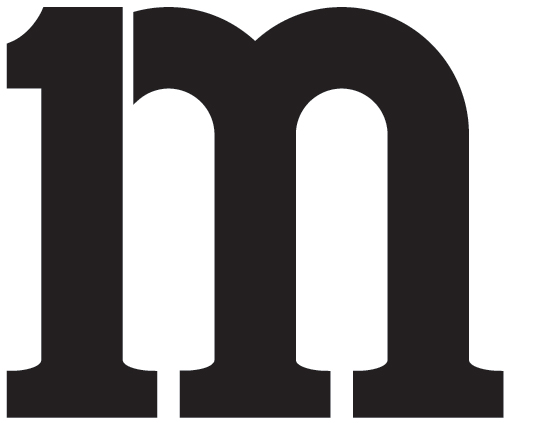
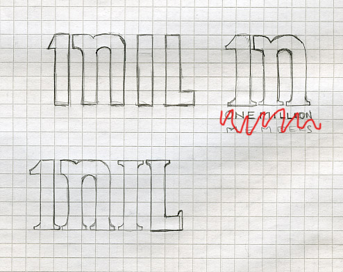
I'm working on a logo for company. The company has recently reached a milestone of reaching 1 million members. They want a visual mark/logo to use on commemorative plaques, buttons and other items. I've started with a simple approach. I believe the acronym for 1 million is 1M. This is for use in the US. Please check out my sketches and let me know what you think.

gracias.
Neat concept that has a lot of potential. I think the style depends a lot on the company and industry - Could you tell us a bit about that? If it is 1 million business owners it would need to be very different than 1 million school children.

p.s. I was reminded of this: http://logopond.com/gallery/detail/58665

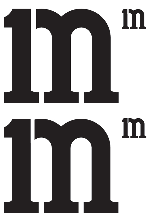
I like the top right one best. Maybe you could try a stenciled version.

I read 1nIL & 1n.

The company is the leading Emergency Roadside Assistance company in the US. Because this company is US wide. It's broken into several branches, meaning states. This particular achievement is for two states. The client wants something that is simple yet sophisticated and not necessarily representing the neaty-gritty side of the business. They want to focus more on the excellence of the achievement. This logo will used in various applications such, Board Members Award Plaque, Annual Report, Employee t's/commemorative plaque...etc.

@ luma - yes, i found that exact one as well. good inspiration for me.

@ riccard0 - me too.

heavier slab serif for my 2 cents then.

@ Ratbaggy - I think you're right. I think this reads/looks better!?

I think you need more space between the 1 and the rest of the em, because when you scale it down, the 1m effect is lost. The space needs to be closer to the size of the space between the two serifs of the em.

Otherwise, I think it's pretty cool. Well done!

Alaskan i'll try that and thanks!

bigger gap between 1 and m. i think i like the bottom one. thoughts?

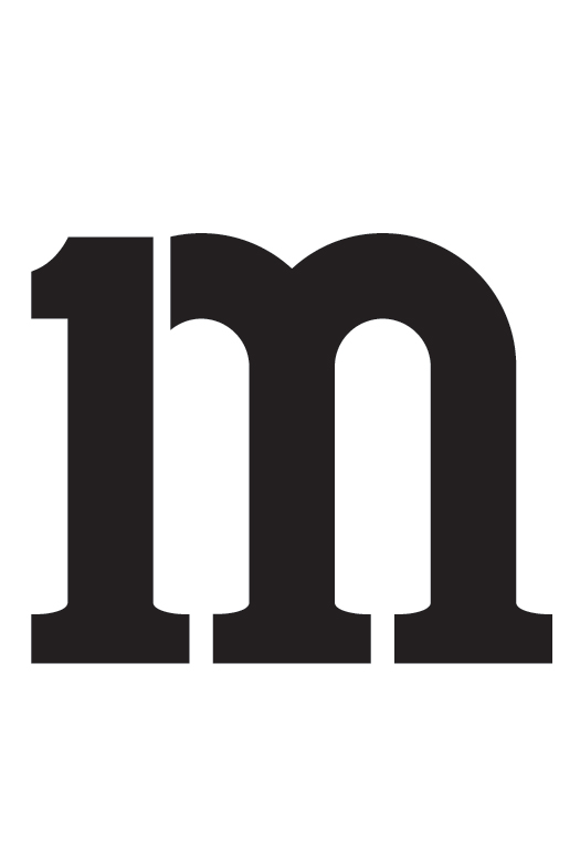
Liking the design, but maybe try cropping the top of the 1 so it's level with the M ending? see how that looks?

*edit* Bottom one looks more suitable

hey chris, i'm not sure i'm following you. i'm guessing you mean drop down the upper part of 1 and align with meeting of arc on the M to 1. is that right?

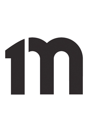
cropped top of 1. thoughts anyone?

At small sizes this reminds me of M&Ms candy. I would work toward something that is more of an uppercase feel. In math, Mega- is M (* 1,000,000) while milli- is m (* 0.001), so the M comes across a lot larger than m that way as well.

Luma Vine, thanks for your insight. The logo will more then likely never be used smaller then 2"W and will be accompanied by the tag "million members".

I too get an M&M feeling from this — and I'm not liking that I do.

It feels a bit tall and skinny. I would lower the arc where it meets the stem (or 1). I would also try cutting the left side of the middle serif off. That would help distance it from looking like '1n'. Try looking at different slab serif 'm's to see how they're constructed. For instance: Arventa

Just saying...

maybe seems a bit left heavy...but like I said...just sayin

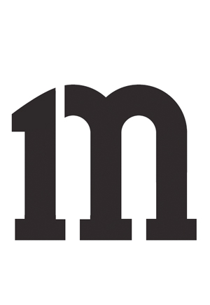
maybe like this? its smoother...

The slab is nice, but it feels very tall. The proportions of chillyphilli's suggestion are very appropriate for the time, and so is the sans-ness of it. We all know a company brand shouldn't have a time- or trend-specific logo, but where this is a marker of a specific time, I think it fits the bill. Thoughts?

I immediately think of m%m candy when I see it.

chillyphilli's is nice

thanks everyone. i'll tinker with it today and see where i end up.

For what is worth, I think you could go to the opposite direction: lower the curve so that the top of 1 reads more as the serifed notch of m.

riccard0 i kinda tried that in my earlier posts. i'll revisit that as well. Now that's it's pointed out that it looks like an M&M "M" I'm can't stop seeing it. =| I gotta keep reminding myself it's not going to be used without it's tagline "million members". I hope that helps differentiate it from the M&M feel. thanks man.

Yep, chillyphilli's is nice indeed.

I agree with riccardo, i think you should try it with a notch
Please show us the finished logo! :)

I would stick with a slab serif. The sans serif approach reminds me too much of the old marchFIRST logo, which was based on Trade Gothic. Sorry, I couldn't find a better example than this small one.

thanks everyone. I'll be posting the final version early this week. Thanks for all your creative suggestions. =)

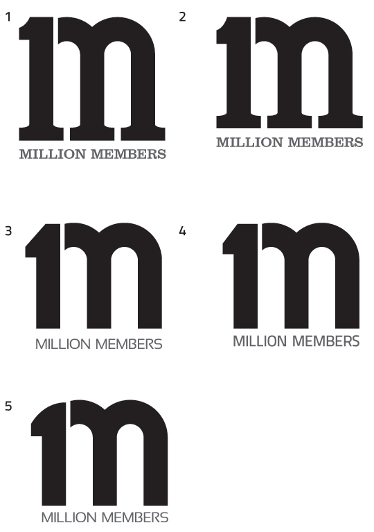
okay, any thoughts before I present to client. =)

I like #5 best. It's cool and it doesn't read m&m's. Minor tweak: the 1 is just a hair too thick to my eye. It's likely just an optical illusion, but the 1 looks thicker than the other two. Oh! And the top right corner of the 1 looks a teeny bit lower than the arc of the em it would hypothetically connect to (if the break wasn't there.) That imaginary line looks like it has a kink in it.

I think you need to stack "MILLION MEMBERS" to make it readable at smaller sizes. Even printed at two inches high, it's just too tiny (and too frail) to read.

All those repetitive tall stems in "MILLION" really don't help, either. Have you considered switching to lowercase for readability? Or choosing a heavier font weight? The block of skinny uppercase letters look very uptight - and kinda scared - under a single organic and bold lowercase em.

Just my humble opinion. :)

i personally like the matchfirst logo, if you can just pilfer that one (?) haha
out of the ones you showed me I guess number four works best?
I think the problem with this logo is the gap between the one and the m, it disrupts the flow of the logo
Maybe give it another think?
I still like the san serif M

Sorry chilly, but I disagree. I think the MarchFirst logo is extremely awkward and unrefined. Why are the arches chopped off on top? The type is...well, it's so unprofessional it looks accidental.

The break in hola's logo is lovely. It tells the story. It actually reads: "1 m" Without it, the logo is nothing but an odd-looking "m" just like the marchFIRST logo/mess.

5 for me, though I don't like the odd hump on the top of the '1'. It also still feels a tad tall.

'million members' is too frail and doesn't work with the mark you've made. It being grey doesn't help its frailness either.

I prefer #2.

FYI, Alaskan, the marchFIRST logo's arches aren't chopped off. That's just a project of the JPG. I found a better image:

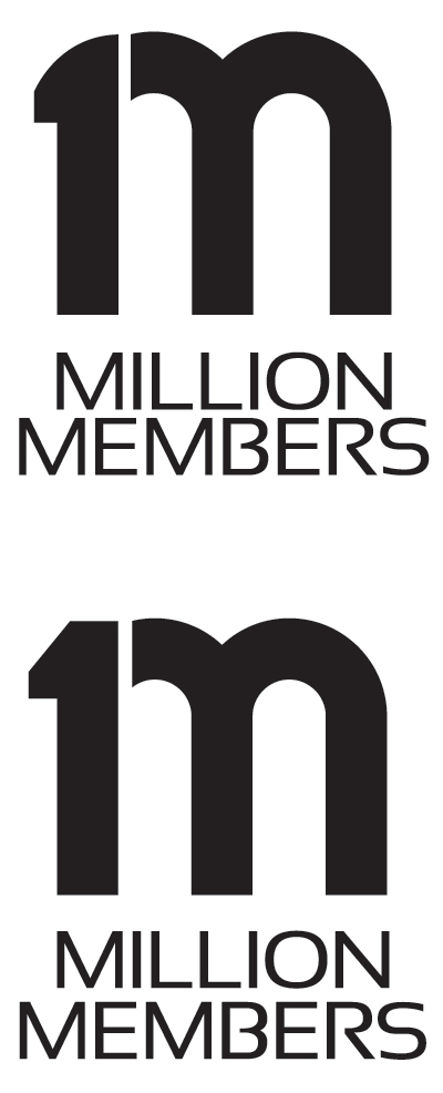
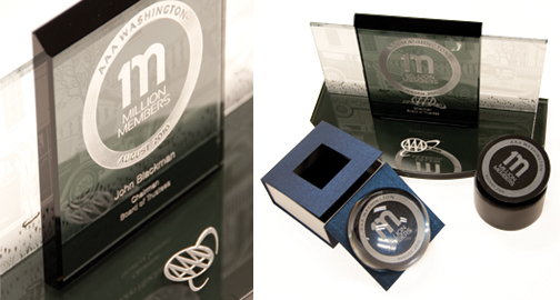
After some deliberation, client and I came up with a middle ground on logo. There was some concern about the top option's "1" not reading as clearly. Came to middle ground and the end result retained the original concepts direction. I'm pretty satisfied with it. I will be posting some of the pieces we created with the logo. Thanks for your help. Much appreciated.

Thanks everyone. Piece was well received by client. =)

Nice

Very nice. Congrats!

Looks much nicer when applied to end products. Logo by itself isn't as nice though. But it works and gets the job done. And that's what matters. Well done.

Captured from web.archive.org on 19 Apr 2015. view this capture