I would be curious to know who designed this. It appears to be top secret.
I was surprised not to see a long typophile thread about this thing. it's pretty horrible!
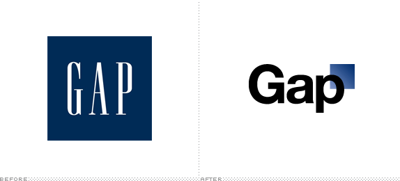
http://www.underconsideration.com/brandnew/archives/gap_logo.gif
I would be curious to know who designed this. It appears to be top secret.
I was surprised not to see a long typophile thread about this thing. it's pretty horrible!
http://www.underconsideration.com/brandnew/archives/gap_logo.gif

I do not know why generic looking logos is the cool trend now a days. The old Gap logo was just fine.

One site claims it was designed by lairdandpartners.com. I took a quick look at their site and saw that they do graphic design work for Gap, but I didn't see any mention of the new logo.
My first impression is that the new logo is awful, but I'd like to hear the Gap's reasons for the change. My guess is that their previous logo looked a bit old and stuffy to their target audience of younger people, like the logo of a place their parents would shop at. And perhaps Helvetica is viewed differently by younger folks who weren't even born yet when it was at the height of its popularity.

...the cool trend now a days.
Old hat.
Check out #6 of the Helvetica Meditations (2005)

It’s probably some intern’s fault. I’m sure a college kid forgot to outline the new logo fonts in Illustrator and it defaulted to Hellvetica on the web designer’s windows machine. Now if only I could figure out what defaults to a blue gradient…



Looks like they wanted a logo to match some standard Powerpoint template.
If I had made that I'd make it top secret too… :-\
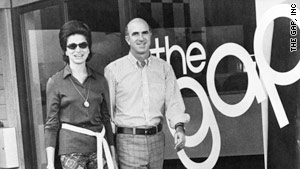
Helvetica has been part of the Gap brand for a while, with the bold weight prominent in the 1969 jeans adverts and in-store material.
Here's a shot I took in 2004.
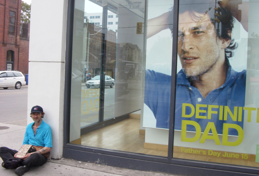
Who knows what marketing strategy, what design process, what corporate politics, what client-supplier relationship, led to the new generic identity?
Sohappy2, I agree with you! The old logo was way better! In which typeface was it set before the new "Helvetica" logo? Maybe if they had used some compressed Helvetica...
Maybe then is just a matter of getting used to the new one. I don't know.

Then again, their new ‘logo’ is probably the least thing to shudder at.
Love that link, Nick. Thanks.
But #6 is Arial.
Well yes, but in as much as Arial is Microsoft Helvetica...

I'm not a fan of the new GAP logo, looks a bit cheap? with that slightly faded/worn blue square.
Maybe they should have played on with the word a bit?
Or just left it was it was, just changing the typeface?
Also Helvetica is so cliched. Use Akzidenz Grotesk or something, sheesh :P
«Thanks for everyone’s input on the new logo! We’ve had the same logo for 20+ years, and this is just one of the things we’re changing. We know this logo created a lot of buzz and we’re thrilled to see passionate debates unfolding! So much so we’re asking you to share your designs. We love our version, but we’d like to see other ideas. Stay tuned for details in the next few days on this crowd sourcing project.»
http://www.facebook.com/gap/posts/159977040694165
:-\

LOL.
Aha.
So it is a sly ruse to generate virality and rile graphic designers into making their new logo for free.
Speculative work trendily renamed crowd sourcing.
Is this sleazy conceptuality what passes for marketing "creativity" these days?
Don't think I will be playing that game.
Nick Shinn, R.G.D.

Is that the future of design? Might as well retire now.

You may be laughing now, but wait until the fad catches on :)
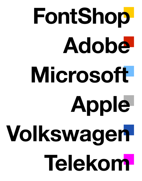
Mmm... Jens’ samples remind me of some other squares with gradient… Especially the Adobe one (not sure why ;-)
My guess is that the negative reaction caught the Gap by surprise and they're using the "crowd sourcing" offer as a diversionary tactic.
They undoubtedly have a lot of time and money invested in their new identity, and are probably hoping that the furor will blow over quickly, especially if people become sidetracked into judging a bunch of amateurish submissions.
If it doesn't blow over, they'll probably just hire a new agency.

Hilarious website!
http://gapyourself.com/
An update on the logo situation has been posted at the brand identity site "Brand New". It includes this statement from a VP at the Gap:
"The new logo was designed by Trey Laird and his firm Laird and Partners, who have served as Gap’s creative directors for many years, while working closely with Gap of North America president Marka Hansen. While Chandler stresses that Gap stands by the logo they’ve created, they also want it to signify that the company itself is changing — and that should come with input from consumers.
“I’m not going to comment on specific aspects of the dialogue. But we’re thrilled about the energy and passion that customers have shown. We want to collaborate with them.”
— Bill Chandler, vice president of corporate communications
The article also includes an interesting open letter from the well-respected design firm of Siegel+Gale, which would like to get the job of redesigning the logo.
http://www.underconsideration.com/brandnew/archives/follow-up_gapgate.php

Ya, OK, whateva. Gap quality then crowd sourced?
http://99designs.com/logo-design/contests/design-better-gap-logo-communi...
Good luck with that. Can it get any better?!?

I quite like the concept of that one myself. I'd adjust the spacing a smidge, and have the round parts of letters thin at the joins (like a decently done typeface), but the idea is pretty fun.
T

I found this article on the topic.
http://www.bbc.co.uk/news/magazine-11517129
Excuse me all but I didn't read it yet. But it looks in line with the discussion.
Back to the old logo:
http://www.gapinc.com/public/Media/Press_Releases/med_pr_GapLogoStatemen...
It's the right decision, but wow, what a fiasco.
Was it a fiasco, really? or did the Gap just create a huge buzz with lots of free press and get lots of people to pay attention to them?

I think it'd be hard to blame the ad agency/design firm. The responsibility is typically with internal marketing or, more often than not, the strong opinions of a few folks in suits.
I can't say if this was a fiasco or good marketing in the end. I can't see the attention it got being GOOD attention. I wouldn't feel any better about shopping at the Gap because of this attention.
It doesn't really show them as a strong-minded company with the courage of their convictions. But they should have chosen a better logo option in the first place, as I am sure there was more than one choice. I suspect the people at Gap being presented with the logo were a load of design-illiterate suits being talked at by some gift-of-the gab marketing department flanneller.
It's a nice simple typographic solution with the blue box everyone so desperately wanted as they put it. At least the logo isn't just visual pollution like a certain Olympic logo.
The logo is just a resemblance of their clothes and customers. Bland and unimaginative.
> did the Gap just create a huge buzz with lots of free press
I don't think it was a deliberate P.R. strategy. It created angry customers and negative press.
Even with good designers & executives at the helm, bad missteps can happen sometimes in logo design, just as good movie directors sometimes have flops, or good authors sometimes write a stinker. It happens sometimes.
...the strong opinions of a few folks in suits.
A little knowledge is a dangerous thing.
The client had seen the Helvetica documentary, apparently.

I think a suitable gap has gone by- it might be safe to post this now.
New Gap Logo? No worries.
Captured from commoncrawl.org on 27 Apr 2015. original URL