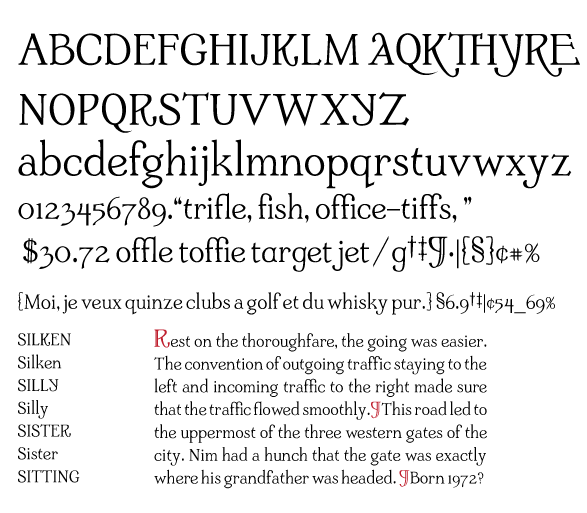
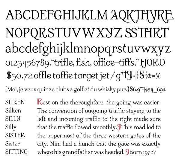
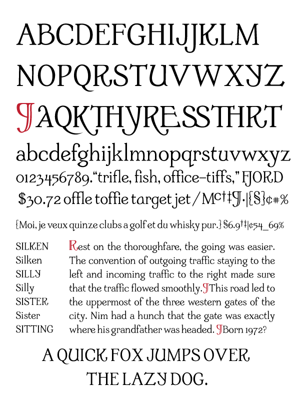
A nice face! The quirks are generally quite appealing IMO.
The upper/lower terminals on /C/ and /c/ are opposite from what I'd expect, which is weird to my eye.
The curve of /t/ is a great idea, but perhaps could be done in a more subtle way so as not to jump out so much.
Middle vertex of /W/ seems unresolved.
/Y/ could use some rebalancing.
Top of /a/ (the two-story one) looks a bit wimpy.
/x/ may be too narrow. Perhaps /X/ too.
This has a nice character to it, and it's well suited to going off with alternates as you've begun to do.
Part of making my first text font was trying to make all the mistakes possible, so I could learn about what goes into making a complete typeface. One mistake was to get ahead of myself in creating glyphs, and I find myself making that mistake again- but I can't help adding alternates. I would like to iron out kinks in the glyphs before moving on- so any help- pointers etc. will be greatly appreciated.
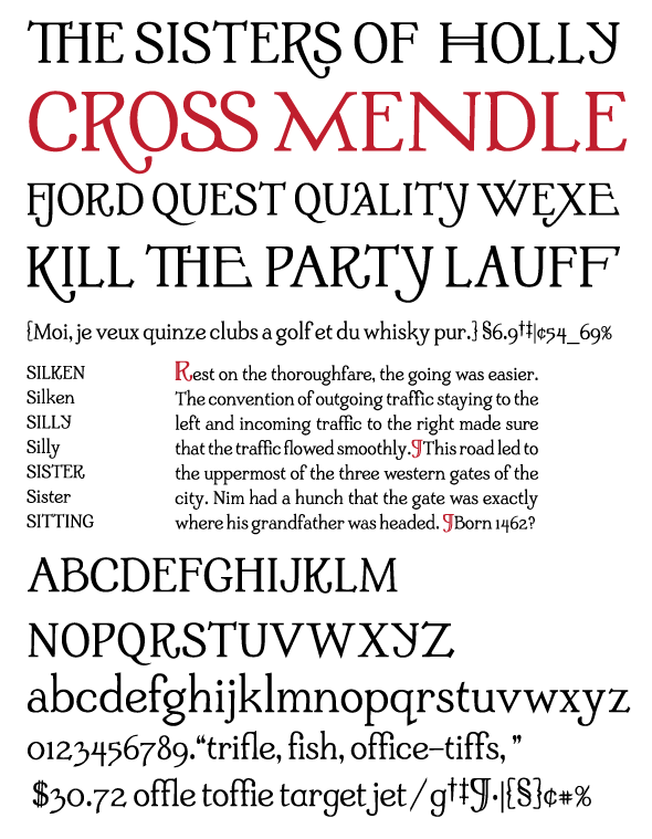
The PDF is the vector version of the jpeg.
| Attachment | Size |
|---|---|
| TextTwoTest579.pdf | 157.58 KB |