
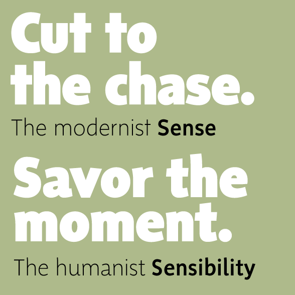
SENSE & SENSIBILITY
Shinntype sans serif super-family
Sense & Sensibility specimen (pdf)
Artist Statement
Over time, many of the functors of page layout have become formalized within the concept of typeface as morphic categories, categories being the semantic building blocks of perception at the level of both individual physiology and social production.
First size, then case, skew, weight, horizontal scale, serifization and grading have evolved as the axes about which type families may be configured. To these Nick Shinn has added a cultural axis, with modern (Sense: minimalist) and old style (Sensibility: humanist) posited as the poles of the sans serif genre.
Designer Statement
Shinntype’s Sense and Sensibility comprise a super-family of two large x-height, semi-condensed, contrasting styles of roman with italic, sharing stem widths, vertical metrics, and approximate horizontal scale. There are eight weights, with alternate figures and identical tab figure width across all 32 fonts.
Ascenders are taller than capitals, and descenders quite short. This, along with compact horizontal proportions and exemplary fit, provides an assertive presence in headlines and accommodates tight leading in text.
Manufacturer Statement
Sense and Sensibility are the new go-to types with the big look and all the weights. Compact, elegant and strong, they command any page -- from the largest headline to the smallest text, for corporate, publishing and advertising work.
Copy fit is almost identical between Sense and Sensibility, and between roman and italic. This means that faces may be switched in a layout, or combined, to subtly change flavor without re-formatting -- use this feature to offer clients two options with very little effort, facilitating sign-off.
Sense and Sensibility have full European Latin coverage for 40+ languages, and are competitively priced -- the family packages offer exceptional value at $149 each, and the super-family of all 32 fonts is only $249, a per-font cost of $7.78!
Available from Faces, Fonthaus, Fonts.com, FontShop, FontSpring, Fontworks, Linotype, MyFonts, Paratype, Phil’s Fonts, Veer, and YouWorkForThem.
About Shinntype
Shinntype was founded in 1999 to market Nick Shinn's type designs. Shinn’s background as an artist, writer, art director and graphic designer informs his eclectic type designs, which run the gamut from revivals to experimental work exploring new technology, and are used in everything from packaging and advertising to internet, book, magazine, and newspaper publishing, around the world. He has produced many retail fonts, including the casual classic Fontesque, the unicase-monowidth type Panoptica, and the OpenType script face Handsome Pro, as well as commissioned work for corporations and publications such as Canada's national newspaper, The Globe and Mail, for which Sense and Sensibility were originally designed.


