
Hello!
I'd be very grateful if you would give me some comments on my "The Road" by C. McCarthy book cover... it's done as an exercise. And because I loved the book. :)
Thanks!
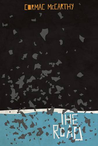
Hello!
I'd be very grateful if you would give me some comments on my "The Road" by C. McCarthy book cover... it's done as an exercise. And because I loved the book. :)
Thanks!
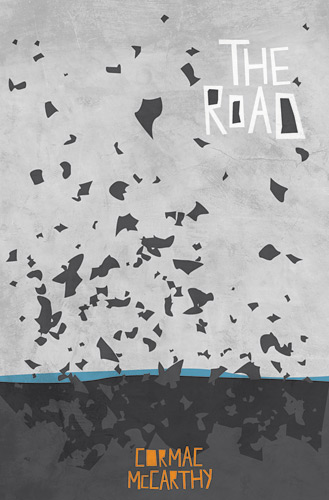
Here's another version...

Hi Neven,
I really like your idea as well as the execution. I prefer the second version because it shows more of the dirty background texture and it has a better colour balance. Even so, I'm not sure about the horizontal blue stripe. It seems to me that it doesn't do any work in terms of symbolism and a second colour (the first being the author's name if we take the rest as different degrees of grayscale) is just too much.
Also, if you have access to a printer you should see how they look covering an actual book. At least, this usually helps me a lot.
Keep up the good work,
á
Thanks for your comment, akos! I also prefer the second one. :)
I would leave the blue line, though, because it symbolizes the sea - here's a quote from wikipedia revealing some of the plot:
"Realizing that they will not survive another winter in their unspecified original location, the father leads the boy south, through a desolate American landscape along a vacant highway, towards the sea, sustained only by the vague hope of finding warmth and more "good people" like them"
I'm familiar with the story, but as far as I remember, the sea turns out to be far from the blue salvation they hope/expect it to be. Anyhow, I just think a less varied colour palette would reflect the bleak tone of the book more adequately. I might be completely wrong though.
You might be right. :)
I'll try and play more with the colors... Or less. ;)
Good luck with it and do share if you have anything.
Just wondering: why aren't the counters in the A's filled in too?
No reason, really. I can fill them. :)
Captured from web.archive.org on 25 Jul 2014. view this capture