and here is the italic

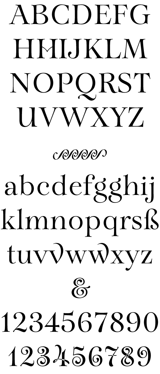
Hello guys, this is a display font i've been working on for some time. I' am now getting close to finish. Its a two weight family with regular and italic (more cursive perhaps). This a sample of the regular weight.
it will be a somehow playful font with a fair range of ligatures and ornaments, and a set of ornamental figures.
It's called Aria in reference to its musical mood.
Could guys tell me what you think? Anything you would fix or change. Any thought please.
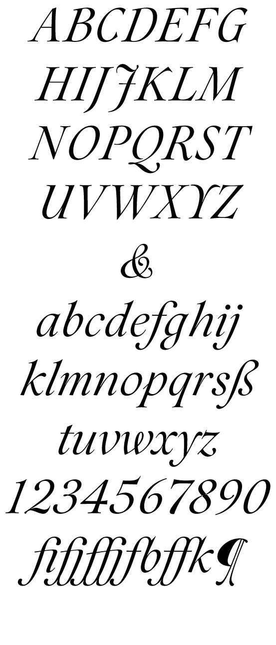
and here is the italic

BTW, no spacing is done yet.
Looks beautiful! Nice, a more rounded feel.
Quite interesting stuff.
The swashes on the lowercase 'v' and 'w' don't seem to fit. Too sharp, and perhaps too large.
Nice work! I really like your swash numerals.
Looks really beautiful!
For the "v" and "w" swashes I would go with the flavor of the interior of the "3" and "5" swash numeral. I prefer this to the interior of the "6" (seems rounder)
go! ;)
a,
Most wonderful! The numerals are exquisite and intriguing.
beautiful, i want one!
Looks good, but I think you need to merge the contours in the alternate numerals
Very nice - I particularly like the 'flowing' feel to the italics.
One comment on the name - while I like it, it's already in use by a very different free font, although the name is much more appropriate for yours. A little googling found that Arioso is a well-known font, but Ariose seems to be available.
- Herb V B
Thank you everyone for the comments.
Philips - you're right the contours are not merged yet. Normaly merged this kind of intersection only at the end.
HVB - I didn't know that, thanks for the tip. I will rethink the the name.
I'll show more here.
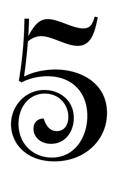
Meanwhile he goes a detail a zoom on numeral.

Apologies for the errors, here go the corrections:
Philips - you're right the contours are not merged yet. Normaly I merge these kind of intersections only at the end.
Meanwhile here goes a zoom on a numeral.
About that 'flowing' feel on the italics, that is actually something I'm trying to achieve. I think I will call it Cursive instead of Italic.
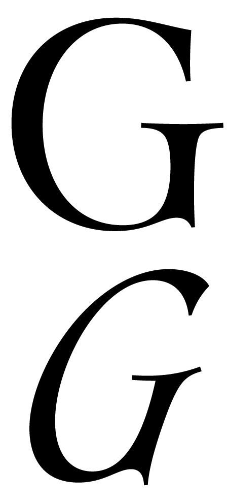
It turned into quite a separate font, I guess. The letters are a bit more calligraphic, the angle is very different, and the barbs and some serifs turned into more organic terminations. Here goes an example of the "G".

Fascinating italic. This looks like a size 60/72 master…
I wait for your design of a size 12, I think it would be enormously interesting to see it in book setting…
Beautiful, and yes *really* interesting.
I was expecting V and W of the italic to be swashed.
BTW, how can you design without spacing? For me, it would be impossible, at least to some degree, to define the form widths in harmony, without testing space at the same time.
>>beautiful, i want one!<<
I have second thoughts:
(roman)
1. something bother me in lower bowl "B"
2. I would like "W" with two-sided serif in the middle
3. Your swash "6" looks "empty" in its upper part
Aha... Do you plan to make alternative "Q" (with long tail)?
In one word: gracious :)
Claudio, I will some day start a text version for this, but I'm not planning on starting that endeavor right away. I guess it's good to start with a more exuberant cut like this and them tame it down to a text face.
I also think it's a bit impossible to design the letters without working on spacing too. Roughly, the spacing I have here is the result of the designing of the Leters and balancing with the negative space.. But I'll go over it again of course.
Ben, I wasn't thinking of those swashes, but I guess it could be an idea. It Would match the alternative J. But I'm not planning on making lot's of swashes :)
Jan, Thanks for the input. Maybe the B has a bit of flaccid belly, I have to look into that. On the ornamented six, I was planning to use the spiral on the upper part, maybe it will work better.
And yes, there will be a long tail Q, of course. :)
Captured from commoncrawl.org on 28 Apr 2015. original URL