

I'm working on this new Didone style. It's characterful with high contrast and ink-traps as a feature, tapered stems and a 'bumpy' appearance. I'm not sure about the cap G, but I quite like its quirkiness.
Any comments welcome.
I'm working on this new Didone style. It's characterful with high contrast and ink-traps as a feature, tapered stems and a 'bumpy' appearance. I'm not sure about the cap G, but I quite like its quirkiness.
Any comments welcome.

i like it ; keep going, i already want one!

Why the ink-traps? It’s ‹bumpy› enough as it is – looks promising. Not sure about the corner ending of the r’s drop though.

It has that "Kepler-like" style. Very good!

Two thumbs up!
The serifed thins (upper right of C/G, and maybe lower left of A/M) could use more weight IMO.

I don't know if this is helpful at all at this stage, but you might want to have a look at Faberfonts' Dagi for a related approach.
Thanks everyone.
Craig, I have added a bit more weight to the terminals of the C and G.
Why the ink-traps? - They help to create thin strokes and also give 'air' to what would otherwise be a very dense design.
Dagi is interesting Akos, but maybe not so relevant to this design. It reminds me of Stilla.
More samples to follow.

Here's how it's progressing.
Is there any bend (e.g. cupping) to those horizontal ends at top and bottom (e.g. terminals of stems, top of T, bottom of L, top and bottom of E)? If not, should there be? They look a little rigid in these images.

This is a very nice idea.
My feeling is that the long concave sides (caps, ascenders) need some more work to fully realize this design. The right and left curves seem a little different, with the extreme generally being lower on the left, and maybe pulled in a little bit too much. The column of the I seems a little top heavy to me. I'm not saying it can't succeed weighted more toward the top--I don't know--but it feels a little too much now. The difference between the left and right of the "l" also doesn't feel totally right.
Yes Craig, there is subtle cupping on the T, L and E.
William, the stem curves on the left and right are not similar - intentionally. Having done so many sans fonts with symmetrical aspects I decided that I'd had it with symmetry for this typeface.
Nick, you may well be able to make asymmetry work. What may be unsettling to me is that it is *almost* symmetrical. I know Matthew Carter, in his critiques at TypeCon, often makes the point that if something is going to be a feature, it needs to look like a definite decision. I do think you can have subliminal stuff that works, but I'm wondering whether if you go further one way or the other it will strengthen it. In any case, it looks good already.
I'm trying to create a Didone with distinct character that will be taken seriously. I want a look that is formal, but just veering towards contemporary informality. I don't want to go too far down the road that leads to fonts like Nueva and Jimbo, however much I might admire them. I wouldn't want to exaggerate any inconsistencies which may introduce a note of 'cartooniness'.
IMO it looks distinctive enough without any more quirks, besides if it's unsettling it's interesting.
Here are all the caps and lower case plus numbers.
Looking at it now - are the cap stems heavy enough?

This is going to be lovely. A few things I wonder. Is there too much space in the top "v" of the "k"? Looking again, I think the asymmetry of the tapers on the caps generally works well. But the H still seems off to me. Is it too narrow? Maybe it should be more straight internally, and/or widened. I feel like the I needs to pull up his pants a bit--the waist is maybe too low. The 5, should the top going into the thin vertical be more like the 7?
On the weight of the stems, maybe the issue on the caps is the relationship between the vertical and diagonal strokes. I don't know of the diagonals should be a little lighter or the stems heavier. With heavier stems you'd probably have to adjust vertical arches...
I second what Bill said about the /H/ and the /5/.
The thin arms of /X/ may be a little too floppy in their curves.
I'd consider getting a little more white into the counterish interior of the hooks of /J/ and /j/.
In addition to considering widening of /H/, /B/, too, could use a touch more width to its counters, IMO.
Does the shape of the serif of /c/ threaten to be read as an /e/?
I love the upright of /G/, and the tails of /y/ and /Q/. The energy of the lowercase is just delightful.
Have you ever looked at Novarese's Fenice Ultra?
A mixed-case sampling of words would help judge the thickness issue.

For interest: ITC Bodoni Brush.
Thanks, some valid points there. I shall amend some characters accordingly.
Altered characters; c, j, k, A, B, H, I, J, K, M, N, V, W, X and Y. All cap diagonals are thickened, plus more weight on top right of V, W, X and Y.
I like 5 and 7 as they are, the top of 7 goes into the stem with a slight inward curve to compensate for the acute angle, whereas the top of the 5 joins the stem at an obtuse angle so it isn't needed.

How is this German double s looking? Is that little serif at the top of the x-height on the left of the stem necessary? i quite like it, but it doesn't have to be there does it?

The spur on the ß comes from old designs of the long-s. As a readability issue it is not necessary. The top stroke on the right is way too thin if it follows a brush stroke.
I think that thin stroke at the top of the ß is acceptable in the heavy weights of this genre - quite a few have this.
I have been working on other weights, I think 3 would be good:

I think your light weight loses the charm of the heavy one. I suspect that narrowing the characters will help in the light will help. It may be that even the light should have heavier verticals, to keep the higher contrast. That's an essential part of the Didone look, I think.
I'll try that.
You might check out ITC Bodoni in its various sizes and weights as a point of departure for dealing with the different weights.
I tried it, (ie. more condensed but with bolder stems) and I think it looks better:

It's strange that the blend between the 2 extremes looks almost exactly the same, but the light is significantly different. I must therefore be on the right path.
I've developed a new Display style of this font (which will probably be called Saltaire). It has much thinner thins for ultra-high contrast.
It's caps only at the moment:

Funky.

I really like some of the quirky characteristics here
I think I like this new style of K, k better, does anybody else?


I like it. It almost alone gives a different, softer feeling to the entire typeface. (I would keep the old ones as alternates, though)
It's great!
I really like it also. Have you tested terminal on other diagonals also?
Maybe the upper diagonal is coming too abruptly?
Where? what do you mean?

That K is wanting in the middle, compared to the R. The legs seem somewhat disconnected and the colour is lighter. Maybe you should tighten it (less expansive).
Make the legs thicker and move legs and arms left towards the stems?

Beautiful!
just an opinion - I'm not a type expert or designer. One thing that stands out to me, is the "A" and the "4". The counters look like really sharp geometric triangles, that doesn't match all the curviness of all the other letters. The 4's stem looks somewhat chopped off at the top too.

Fun stuff, Nick!
Is the bottom of the g pushed to the right too far?

That Q is a beaut.

I also noticed the counter on the A being very sharp, but I really liked that.
Do you think a more outrageous more eyecatching ampersand could benefit the typeface?
I feel that the question mark lacks contrast compared to everything else.
The @ symbol is awesome.
This typeface is gorgeous, it reminded me of Aldo Novarese's Normandia (bold and a bit out of the ordinary) would you contemplate a Normandia style numeral 8?
Thanks.
I don't see how the A could be designed differently. The 4 could be pointier and the question mark a bit thinner at the top. I like the g as it is, but maybe I'll move the top half over to the right a bit which will have the same effect. Maybe a Normande style 8 would be better - I'll try that.
Here are new altered characters: 4 8 ? and g. I'm quite happy with them and think they'll stay that way.


Take my comments with a grain of salt as I'm not a professional. Having said so, I can't help sharing what I see. I think the thin verticals of eight might be a bit too thin, making eight look too wide and slightly lighter than the other numerals. The bottom of 7 is a bit too round for me. Perhaps make one side straight, with a similar approach as the terminals? 2 and 5 really look stunning!
Hmm... maybe a bit thin on the 8, but I like that contrast. You've got a good eye for a young whippersnapper Jasper! You've been bitten by the type bug very early - I hope you never recover from it!
Moving on... what do the good folks out there think of these K's? I quite like the ball terminal on the arm even though it's slightly out of character with the rest, giving it an almost Cyrillic feel.


Nick: your overshots could be stronger.
Neither of these are quite there yet: top one is unbalanced, middle one is way better but the angle at which the hairline stroke departs from the leg feels unnatural to me. The ball terminal K has the same issue, and the ball it self doesn't look all that comfortable there. Maybe it's leaning out too far to the right? Maybe it's because it's so vertically compressed.? Have you tried an Ambroise style K where the hairline is bent and curls around the ball terminal, or would that be too much? All-in-all: Of your three samples, number two is the best one IMO.
I like the ball terminal as going with the leg of the K and R. I'm not sure about the size and placement, but it is better than the serif, which is hard to make big enough for balance without looking awkward. I think it's worth trying the ball terminal on the terminals of other thin diagonals also.
I like the round terminal, but it does need some adjustments. My eye tells me that the ball is slightly too large and the bottom leg should go down steeper, but that could be wrong. Do you have any idea when this is going to be released?
Too large? I was thinking that it's maybe too small, or could be a bit rounder.
It may be released this year, but I've a large (paid) project on at the moment which takes priority. I work on my own stuff when I don't have any commissions. Anyway, it's good to leave things for a few weeks or months, that way you have a fresh eye when you return; like spotting if the overshoots aren't big enough :^)
"Too large? I was thinking that it's maybe too small, or could be a bit rounder."
I could well wrong on that part, but there's definitely something a little off.

I've altered the K and increased the overshoots
That new K does look better to me, though I can't tell the difference. The overshoot at the bottom of K looks a bit exagerated. Probably due to the slightly squarish curve.
Ahh I can tell the difference now. Larger terminal :-)

I think the inktrap on the /b/ is too broken looking. Just do the same as the /n/ and make the stem flow into it.
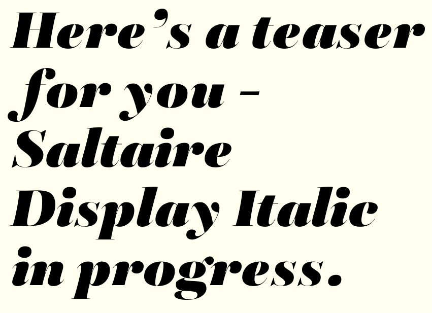
Having a go at the Display Italic. The terminals on the s look a bit weak - I might try ball terminals instead.
Lovely.
Looks good! I agree on the /s/. Tittles look too big to me too.

Great! /y/'s tail can be even larger (growing towards the top). And it's ball terminal looks a bit squashed, but it's nothing serious. /p/ and /t/ are very confident, good work!
This is going to be wonderful. But I think the hairlines are disappearing. Shouldn't they be a little thicker, more like the roman?
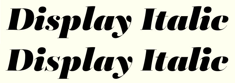

I like ’em both (z), but the bottom one should be wider and also descend a bit below the baseline. For now it’s too cramped. You’d have a nice alternative then.
Top z is definitely better.
I think both z's could be improved on. The weight of the top one harmonizes better with the rest of the face, but I think it dips too far below the baseline, and is a bit distracting. Could you get the weight on both top and bottom, less descent, with no ball terminal? Or you could make it more of a showy swash character by having both ball terminals. Or alternatives, depending on the use?
Unlike Lex, I'm not a fan of the t. To me the left side curve is too extreme, and out of harmony with the face. In old style faces the rule is that the longer vertical strokes are more upright, and that has some visual logic to it. Here your vertical angle is rather more uniform, like a Didone. That makes the t look out of place. It can lean forward a hair, as the t often does, but here I think it goes too far, and is distracting.
On my screen your example is really pretty big, and the thins still look a little weak. It would be great for what some call a 'poster' size, but for regular display I don't know. Maybe just having the thick to thin be a little less extreme. You to want the roman and italic to play together, right? Have you mixed them together? If they work, then ok.
I do like the general overall extreme thick/thin contrast, but OK William, I'll rename it as 'Poster' ;^)
I don't like the idea of having two ball terminals on the z at all, I like the top one and I don't find it distracting. I have backslanted the t by 1 degree.
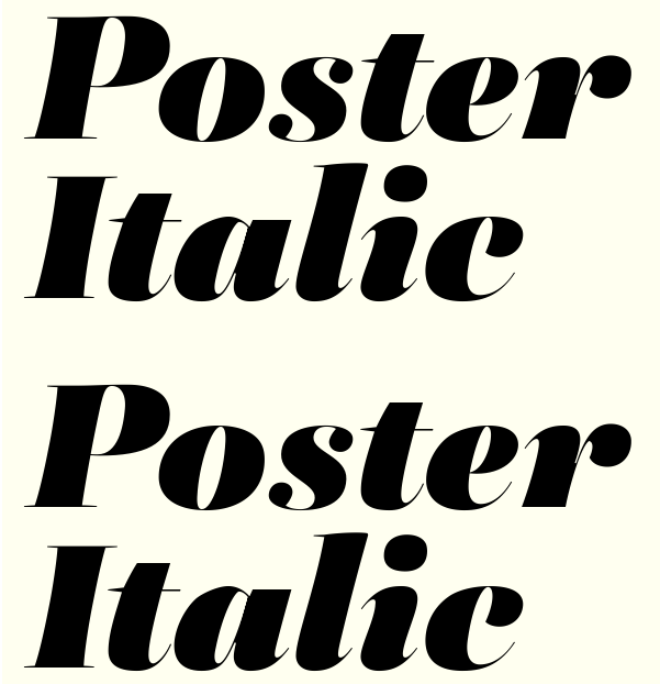
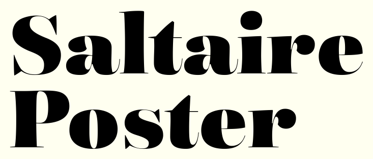
I think they work together.
Is it just me or are the roman and italic t fighting? Should they both have a concave connection or something? Both be straight? I feel like *you* can find a better solution for both. Again, wonderful work.
Who says they have to be a similar style? I tried the Roman style italic and didn't like it - this looks better.
They don't have to be a similar style, but they need to be happy together. The italic t is so pretty that the roman looks clunky by comparison. Would a concave connection between the cross bar and the top of the t, with a nice curve, work better?
Would a concave connection between the cross bar and the top of the t, with a nice curve, work better?
I second that. Also a historical given (history is mostly right).
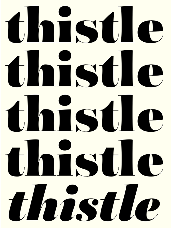
I think #2 is best.
It relates nicely to the ascenders that follow. The convex curve keeps the kind of "pneumatic" character of the face going, but the horizontal terminal keeps it in check effectively.
That's what I wanted to hear Craig. :^)

I think either of the first two would be fine.
Something else though: I think the thins in the "s" are long enough that they need to be thicker. They seem to be sort of falling apart.
hhp
Good point Hrant. It looks a little 'empty' compared to the rest – perhaps they need to be more like the bottom of the e.
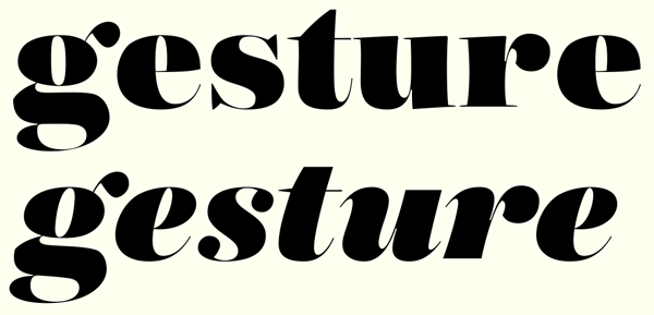
Italic /s/ could use a thicker spine if possible, and a little more width
Funny you should say that... Here's the complete lower case.
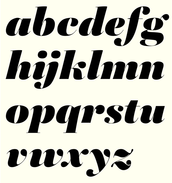
Nice.
The "horizontal" of the "g" looks a little bit too hefty/chunky. Maybe some tapering on its left end would give it the requisite elegance.
hhp
Would you consider a ball terminal on the top of the /c/? That would distinguish it better from an /e/, and would fit in fine with the other letters.
I really admire the /f/, which I think can be a challenging letter in descending, super-heavy form.
Hrant is right about the /g/.
/k/ also still needs work: there's a lot of white around the arm and the whole thing looks a bit wide.
I quite like the new ball terminal on the c – I liked the previous iteration but maybe this is better , have altered the g, the leg on the k slants to the right , more space between the diagonal and top hump of bottom horizontal on the z.
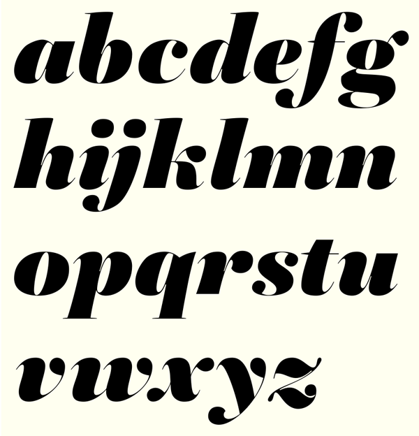
I liked the old c better. The foxtail thing to me gives a fresher, warmer look. I wonder if you could take the other ball terminals in this direction. This is a really exciting design. I think when you get it all resolved it could be a new classic.
By the way, on the t, I do think the slight rotation did help. What I had in mind was a concave left top, going up less high, ending in a vertical hairline. I don't know if it will work, but the idea was to go with the whole fat to very thin theme.

I think the sharp corner on the middle left hand side of the g in both roman and italic looks a bit strange. I can't see any other points in places you would expect to be round, so it looks almost like a mistake. Italic s looks a touch top heavy. z and y are stunning!
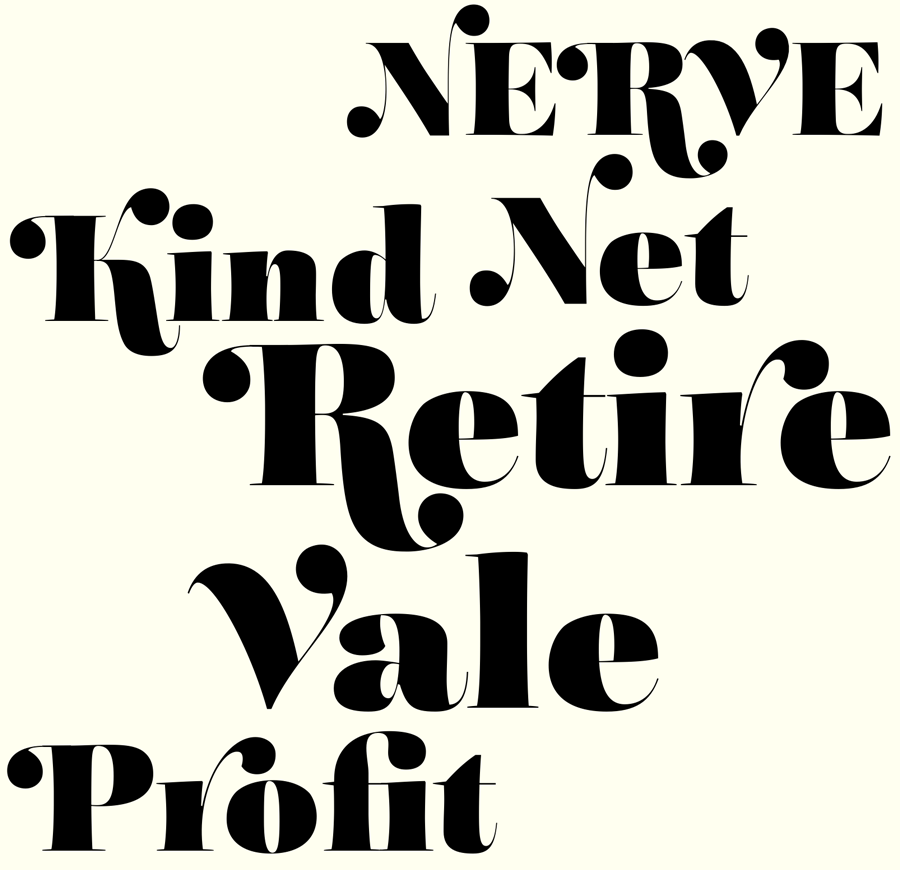
I've been playing around with maybe adding a swash set. Here are some initial characters. The V is a bit more of a departure but I think it fits OK. Haven't done cap E yet. That Ki begs to be a ligature doesn't it?
Super stuff!
hhp
Not sure if going above the cap height so far works. I think that traditionally there is more restraint in this direction, maybe because of accents, or bumping into the line above. I don't remember exactly why, but I do remember trying to go more above the cap height in my Caslon swashes, and then seeing it didn't work. Check out some swashes on classic typefaces and see what you think about the handling of the cap height, if you haven't done that already.
I think the R is very good. I would try bringing down the height of the others, and see if you still get the exuberance, but more harmony with the rest. The V to me is better than the arm of the K, but even it I would try bringing a little lower. As I've said, overall I love this design!
Certainly great additions.
The /r/ looks uncomfortably attenuated to me. Arm of /K/ maybe too, though less so. When the thins are this thin, you run up against limits to how far they can stretch. I'm actually not sure Ki should be a lig, but worth a look. /V/ I love--let's see the /W/.
The preference for descending cap swashes over ascending ones probably comes from the fact that in metal the latter -which unlike the former would be floating kerns- were much more likely to break off. But that stopped happening in digital. :-) Although I guess even in digital there's more room to play below the baseline than above the capline.
hhp
Any way you could send me an email or message here when this is completed? I'd love to purchase it
It's been a while, but I thought I really ought to get Saltaire finished this year. Spurred on by a tweet from Stephen Coles, I have been back working on it again for the past few weeks; concentrating on swashes for the most part. Trying to decide which characters should be swashed and which left alone is proving very time consuming. Some just don't look right and kind of ruin the overall flow, while others are just obviously swashable. It also occurred to me that some are obvious candidates for swash ligatures. So here is a taster of recent progression.

To me swashes on the upright letters look kind of goofy in an 80s way. I like the swashes with the italic though, very nice! People can turn on and off the swashes, depending on the word, so I wouldn't worry so much about how they look when everything is on. I mean, this is a display thing, so designers play with it, no?
duplicate.
Good point William. There's something I'm not too fond of in the upright swashes too. I always detested Bookman, and I agree that the italics look better. I think italics lend themselves better to swashing–it looks a bit forced on uprights. I'll try to improve the look.
Oh, and I don't know why, but the swash italic s seems step better than the others. More dynamic and at the same time balanced somehow.

I don’t know… I would not make a swash version of the lowercase [h]…

Looks really great! In the lc I think you could thin the strokes that ascend and descend a touch at this weight. They look a little too dark. (Doesn't apply to /b/f/j/ since they get relief from tapering, but those rectangular ones /d/h/k/l/p/q/ jump out to my eye.)
Thanks Craig. You could be right, I'll try it. What about the legs of the K and k? — need to be a bit thicker? I just noticed that at iPad size.

Really impressive typeface and wonderful to see how it developed. I've never done a typeface like this but working with these extremes often make it more obvious where you will compensate for what, like the consideration you made with the angles of 5 and 7.
I think the legs of K and k are indeed a tad too light. Perhaps the top should be a bit heavier to make the shape more constant so it flows better with most letters. The bottom seems thick enough.
The G bothers me a bit as I feel the spur should be sharper to be more consistent with the other capital letters but I'm not even sure if that's a valid consideration as it may work optimally in combination with lowercase letters as it is.

I have thinned the stems of /d/h/k/l/p/q/, made the ball of the k bigger, and thickened the legs of the K and k. I think it looks better.
Lowercase k’s leg could still be a tad thicker maybe. Compare with the lowercase r …
Those weights are improved. Loving it.
There's a little lumpiness in the curve at the top of the bowl of /d/( and /q/?).
The ball of /k/ should maybe grow out of that thin like the /K/ rather than being so abrupt.
I know. There are a few lumps here and there. Yes., maybe the ball terminals on the Kk's should match.
New swashes plus a couple of ligs:

Fun! I like the /z/ especially, and the idea of an /n_g/ is great. At this weight extending any stem can cause serious blackness, so maybe shortening/thinning/otherwise lightening the swashes of /m/n/would be worth considering.
I think the balls of the /x/k/ are too small. Maybe bottom ball of swash /s/ too.
I registered here just to say that typeface is exactly what I'm looking for: an elegant, but slightly quirky didone with tons of personality. I hope you finish soon! It's stunning.
Thanks.
I've made the balls heavier on the x, k and bottom s. I might bring the tail of the z down a bit, give the ball more air and make it a bit bigger.
At the rate I'm going, constantly finding new things that need doing, end of October at the earliest.
There will be five weights; Light, Medium, DemiBold, Bold and Black plus italics. Plus Poster Black and Black italic.
Captured from web.archive.org on 6 Aug 2017. view this capture