Hello everyone, I am new member here (as of today) and have been browsing Typophile for some time now. I wanted to step foot into the forums and start getting some feedback and/or critique on some of my projects that I am working on. I am currently a senior Graphic Design student at Auburn University and have been working on personal, freelance, and studio related projects for the past couple of years.
This specific project is a personal project that I am working on under direction by one of my professors. While I can not go into much specifics about it, I can give a general description of the project.
I am currently developing a new method for students to learn/practice how to correctly track/kern, and space typography. With this product, I am encouraging the student to step back from the computer screen and its default metric units, and focus on what is optically(visually) correct using a more "hands-on" approach. The product prototype is finished and I have just established a name for it. I have decided on NUDGE after much research and discussion.
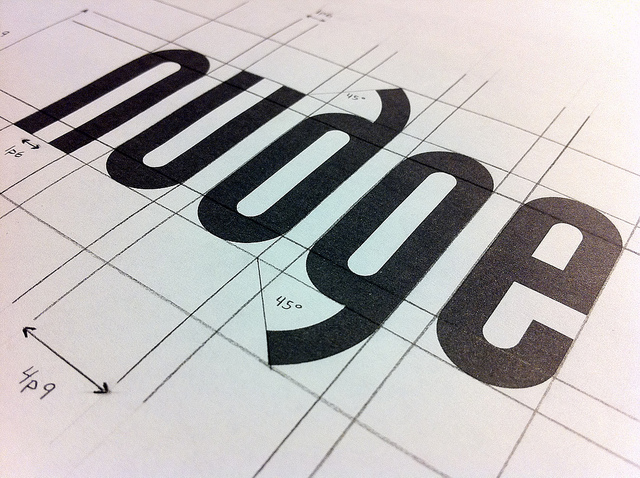
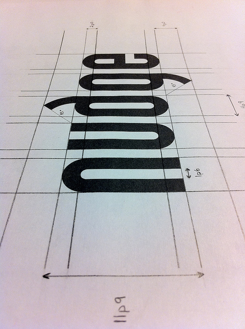
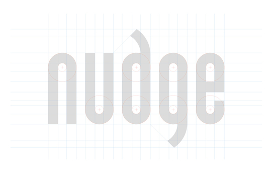
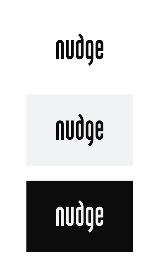
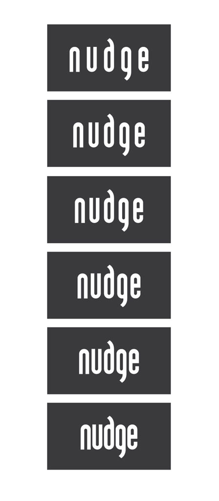
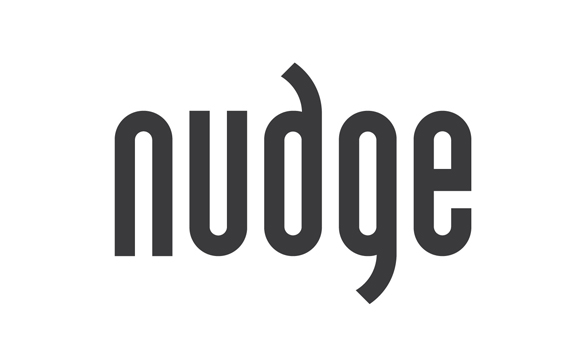
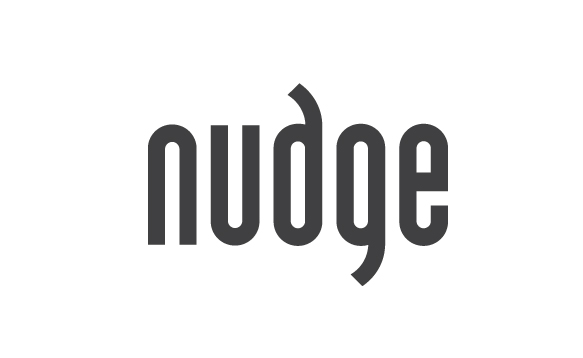
When researching what tracking/kering letterforms is really about, I landed on a few short descriptive words.... "consistent, uniform, gray, rhythmic, alternation of solid and void space". My conceptual vision for the mark was to create a logomark/logotype that was designed around these words. A mark that was very uniform, perfectly spaced, and had a great sense of rhythm and alternation.
I wanted to get some opinions on the spacing, concept and overall appearance of the logomark.