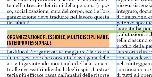
As it happens, one of the jobs that pay my bills is laying out a journal on welfare and social policies published twice a month by a no profit research institute.
The journal is entering its fortieth year of continuous publication, and, while studying how to deal with the “death of print”, we would also like to refresh its printed appearance.
My goal is to add some white space/flexibility and some typographic niceties (such as proper small caps and old style numerals).
Constrains are mostly due to a next to inexistent budget (cram as much text as possible per page, use only already available fonts) and a mostly aging readership (don’t make the text too small).
Attached there’s a first draft of the revised layout.
Any kind of criticism is welcome.
| Attachment | Size |
|---|---|
| pssR15.pdf | 145.38 KB |
| pssRev-A.pdf | 148.32 KB |
| pssRev-B.pdf | 137.04 KB |