Typophile

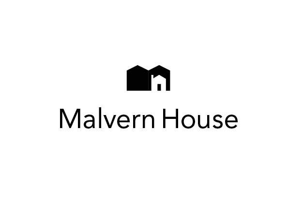
Malvern House Logo

robw

Hello.

A redesign of a logo for Malvern House college. An 'English as a foreign language' teaching college with three big schools in London and numerous affiliated colleges around the world. The redesign was really just a tightening up and standardising of their current logo, which is the words (Malvern House) and a globe symbol - dull I know!

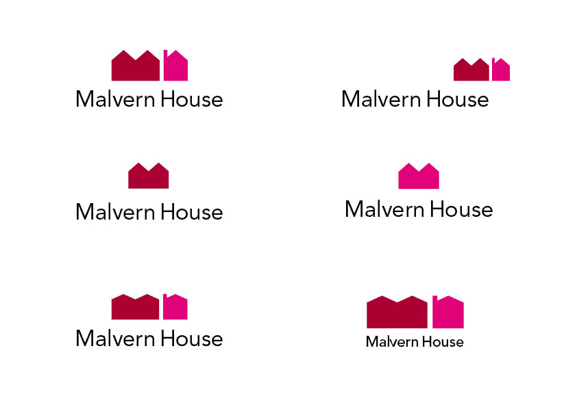
The attached example was one of several 'you could do something like this' proposals. The idea was to take the initials (M h) and turn them into 'houses'. I quite like it but it's not quite right, it's not really 'happening'. Maybe it's too literal? I dunno, It just seems a little clumsy to me.

So if any of you could give me some starting points to turn it into something decent I'd be eternally grateful.

The type is still being discussed (!) but it will be similar to what's shown; simple sans, nicely spaced, nothing tricksy.

Cheers
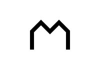
I think you would get a simpler mark by just having a house-like M. You don't need to shoehorn an h into it.

I like the idea and agree with Justin.
Also, i would be tempted to try & mimic some of the aspects of the type and work them into the mark.

good luck

Nice concept, but the type could maybe do better if set uppercase.

Ok, thanks for that.

Justin; Yes, I think you're right, my early versions were just the house/M shape so I've gone back to those.

Victor/Luca; Because it's a college that teaches English, it was felt to be really important not to have anything other than the straight-forward u/lc type. No visual tricks, not even setting the words in caps.

See what you think to these;

try adding a chimney to the mark in the second row.

FWIW I think all marks have this very industrial feel. A factory block. Add thick smoke from the chimney and it'd be a logo for the 19th century industrial revolution :)

That little red house makes me think of Monopoly.

There's no relationship between the icon and the type. Try pairing your mark with a font that reflects the angle between the two buildings. Something like Gill Sans or Nobel (there are plenty of others, find something you believe is well suited) - where the "v" part of the cap "M" (I'm sure that has a name but at the moment I'm drawing a blank) doesn't extend down to the baseline. The font would then mimic the angle created by the two red buildings You may also want to consider something extended.

Good luck with the project.

What if you just had the outline of the two roofs form a M? That seems like it would tie in better with it being more about language than houses. I am thinking something like this:

Maybe use the outline of a book rather than a house.

- Lex

I'm going to have to disagree with those who say use only an M. I think the two separate buildings subtly and cleverly point to M and H. The type doesn't necessarily need to reflect all of the exact qualities of the mark, but there shouldn't be a disconnect between the two. If you use an M (in Malvern) with sloping vertical strokes as opposing to the parallel ones there are now, that would more closely reflect the qualities of the roofs and tie logo together better. Also, give the mark a shot with some roof overhang.

Thanks People

Kirs10; As I said the type is still under review and Gill is certainly a favourite but more for the fact that it is a very 'English' typeface. I was trying to get to where I was happy with the mark first. It's no good finding a face to reflect a mark that keeps changing!

Luma; I had this shape in one of my early layout pad pages together with its 'h' equivalent. And it's a good point about the language being more important than the name. But I was worried it was too much like the Shelter logo (a housing charity)

Steven; Thanks for the comments about the 'h'. But (again) the wording has to be straightforward and if that means a 'disconnect' then so be it.

I'll keep on it...

Captured from web.archive.org on 20 Aug 2013. view this capture