
thanks for all the feedback.
the mark has now been completed and can be see in my avatar.
i'm in the middle of getting my new website up & some stationary done.
thanks for all the feedback.
the mark has now been completed and can be see in my avatar.
i'm in the middle of getting my new website up & some stationary done.

It's a clever design (the one in red is my favorite) and it would certainly work very well in small sizes, and I could even see it work as a website animation with it appearing gradually left to right as if it's being drawn and then the "i" dotted at the end.
But I don't know if I'd see it as a "vi" unless I already knew what it was. Have you tried putting a slight separation between the letters, or making the letters overlap rather than join, or maybe the "v" in black and the "i" in red? Of course those ideas would also disrupt the flow of the logo, so I'm not sure if they'd help or hurt.
thanks for your feedback.
which particular red did you prefer? They are all slightly different.
at this point I think the red ones look best because they are much more refined, the bottom one is refined also, but I don't like it so much as it moves away from the calligraphic form which was the initial idea behind the mark.
i don't think not instantly getting the "vi" part is a problem, i actually like it being quite abstract.
One other thing I would love some suggestions on is the text to go with the logo.
I was thinking of something along the lines of 'DESIGN & WEB' however I can see how that may be a bit of a clichè. Is it important for my mark to convey exactly what i do? And web is a very vague term these days, as one can be a front-end developer, a web designer, a SEO guru or a usability expert. Myself I do design, front-end & usability.
I could also just have Victor Ivanov to go along with the mark, but I think if I were to put my name there, I should probably explain what i offer.
Would love to hear your thoughts everyone, I really want to nail this identity mark and move on to the website redesign + stationary etc.

I saw a person running. Didn't see the VI or Calligraphy connection.

Reminds me of:
It's also weird to see a calligraphically rendered "vi" with a perfectly geometric dot to the i.
hi again,
resurrecting this thread...
still not happy with my mark.
please let me know what you think of this?
have any suggestions, please feel free to express them.
i have tried many other options, but i really like the simplicity of this idea, i just think the execution is not quite there yet...
BONUS POINT on the new version, the formed shape also creates a cyrillic letter 'И' which is the 1st letter of my surname and being Russian, I quite like that ;)
ps, also just realised this may not be the best section of the forum. If any admins see this, can we please move this thread to corporate id? I think i might get more luck there :)
thank you

The mark is nice enough, but without text it doesn't say the name of the company.
It feels a bit like an egg cracking open, which could be a good metaphor I guess. The font you have there doesn't fit the type of business at all in my opinion. Good job pushing forward with new concepts.
tried something else today. [with my fav. feijoa :)]
still not to sure...
Luma : you're right, the type doesn't work at all. Was really just playing with some typefaces, but perhaps a nice sans will work much better. I don't necessarily want the mark to spell out the name, just give out a hint of my initials.
thank you for your feedback.

stayed up until 2am last night working on the mark.
i definitely think it's getting somewhere now.
the colours are not final, not is the mark however i'm very happy with this progress.
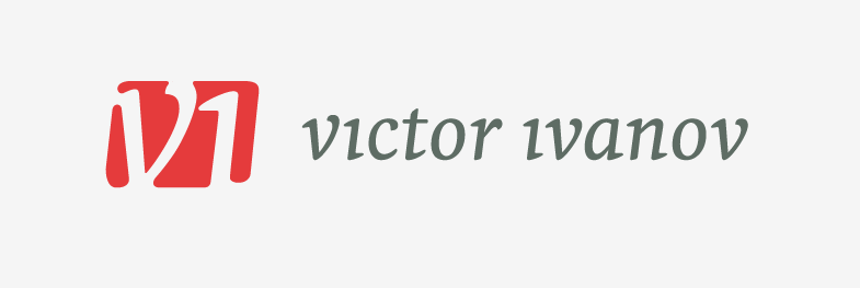
any feedback is appreciated as always

V1?
yep, noticed that.
in the process of refining.
thanks
Maybe you could explain what these latest concepts are attempting to communicate other than your name and initials?
Captured from commoncrawl.org on 26 Apr 2015. original URL