Hello everyone,
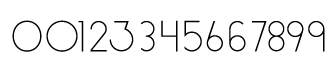
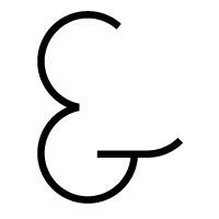
I've been working on a font for a while and I want to take it into a development program to become functional.
However, I want the shapes to be as refined as possible before offering it to the world.
Please be critical, I am taking all comments into consideration.
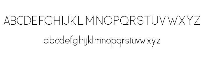
If you'd like a closer view of a letter or letters please ask and I can attach additional files for critiquing.
Thank you