
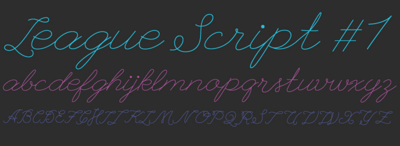
Just finished working on the first part of a free script font project! Free download here :)
Just finished working on the first part of a free script font project! Free download here :)

Cool!
I see you are using ligatures for contextual forms, but I think it would benifit from contextual alternates, let me know if you are interested in such stuff.

I love it!

Very well done! I really like this! There's a certain warmth about it, very charming and whimsical! However, I have 3 small suggestions for further improvement. The capital G could be confused for a a more swashy C. The capital J could be a bit stronger, as it could be mistaken for a fancy I or a lazy L. The numeral 1 could be mistaken for a 7. Other than that, it's an outstanding script!

Interesting work and I would make some suggestions on caps. To me the I and the T are too close. I agree with Studio Becenti, the J could be mistaken for the L. Keep going.
Captured from web.archive.org on 17 Aug 2013. view this capture