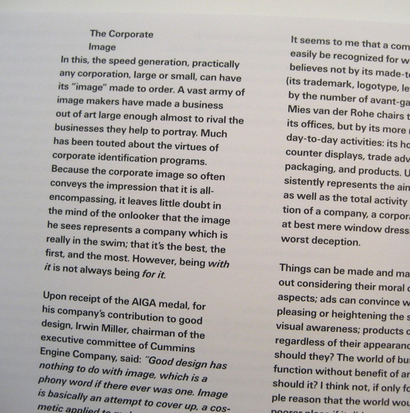
Hi guys, I'm doing my thesis paper on the negative aspects of Helvetica.
Things like the physical flaws of the typeface, the negativities that arises due to the overwhelming success of Helvetica, the possible issues or trends that might occur if the excessive use of Helvetica continues.
I've read articles on the negative emotions towards the font, with people branding the font as conformist, corporate, a fail safe choice and many more. I was wondering if there are even more negative aspects of Helvetica? Like perhaps the physical flaws of the typeface? I know that it is good for header but not body text, its uniform strokes makes it look like an army, hard to read, etc.
My idea is to investigate into the different negative issues with Helvetica, its phenomenon and its impact and tell them to my tartget audience, which are students studying graphic design.
My issue is that designers often fall back to using Helvetica regardless the reasons leading to its overused.
There's always 2 sides to a coin and the same goes for Helvetica. There are much talks about the postive aspects of Helvetica, but not really very in depth analysis of the negative aspects.
Can anyone enlighten me on this? Thanks!