Typophile

{Rotational Ambigram} TRULY WICKED

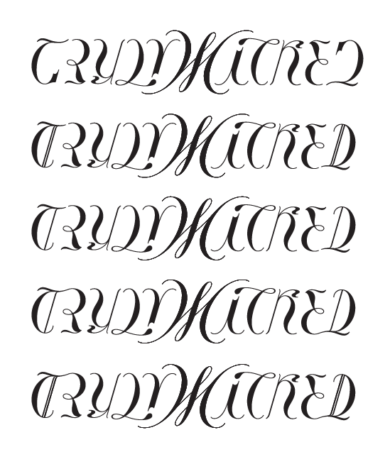
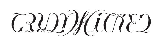
My latest commission for a women in Australia, to be used as a tattoo. It's really wide so here's a small preview and I'll attach a PDF to view in more detail. I'm feeling pretty satisfied, but would love to hear what y'all think. :o)
AttachmentSize
TRULY WICKED 9-15-10.pdf587.28 KB

Extremely hard to read, but visually interesting. I would say try re-posting this without "truly wicked" written anywhere to gauge how many people can actually read it.

I think you could get a much better D by making the T more like blackletter styles such as Old English.

The vertical stem of the T might also improve the R

That's a pretty good idea; otherwise I wonder if an independent vertical could serve as the stem for the R and the D.

WICKED is more apparent than TRULY.

Mixin it up with the T/D combo. Thoughts? Original is at the top:

the stem surely helped. the U kinda read like a Y to me.

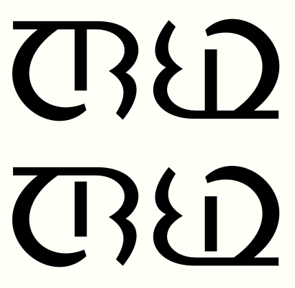
Here's what I meant by the more "independent" vertical, that sticks with the D at the end but gets read as part of the R rather than the T at the front.

Look, here's how you do it. Make a whole, solid vertical that will be the left stem of the R and the left stem of the D. Connect it at the top of the R and the top of the D. Leave the bottom of the D open (but not too open) to keep the T separate, and, of course, the bottom of the R will be open to keep the E separate. A reader's grouping of shapes into letters is biased toward the cues at the top.

Captured from commoncrawl.org on 27 Apr 2015. original URL