
Hi all,
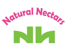
I just wondered what do you see in this logo? (and i mean to the green part...).
Thanks!
Elsi
Hi all,
I just wondered what do you see in this logo? (and i mean to the green part...).
Thanks!
Elsi
Hi again,
This is an idea of a logo for natural juice company.
Any feedback would be appriciated. Thanks! elsi.

It seems a little rigid to say “juice” to me.
And always try it in black and white first.

I see what could be the stem of a plant and the tips of two leaves. Not the part of a plant the juice comes from. Possibly suitable for tea, but as Riccardo says, it looks a bit rigid.
I'm afraid I see "Nh".
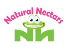
I'm afraid I see a decapitated frog.
Sanish Joseph? Spam spam spam spam!
Here again,
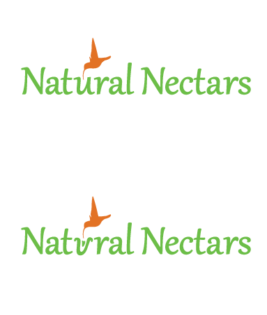
Tried to leave out the leaves (as suggested) and include in the nectar part.
Found myself diggin too deep so i thought to check and see if you think that it is a good direction.
The second version is a (poor) try to turn the U into a flower...still not finished.
The logo should carry some elegance tone.
(almost..) any feedback will be appriciated :)
Thanks,
Elsi

liking the hummingbird,
the flower needs a bit of work, it feels a little weedy & leaning left, maybe chuck a stem for the flower in & see if thats cool?
in fact you could just go with option 1 in my opinion..
the typeface isn't my cup of tea but i can see why you chose it
kia ora

There is a big disharmony between the colors in all of your examples.
Thanks Chilly!
Arno - Thanks, which color would you change? the green or the orange? Any feedback on the logo itself?
Thanks,
Elsi.
I think that a simple solution would be just filling the u with juice.
If you prefer the flower-shape modification, I think r would be a better candidate.
riccard0's idea is good

>> what do you see in this logo?
>> This is an idea of a logo for natural juice company.
Unfortunately I see...a lawsuit from Nantucket Nectars :(
But hey, I'm no copyright lawyer, so what do I know.
I would try other letters as the flower and see if another one works better.
@ Mugford: sorry, didn't get this one about Nantucket Nectars... I googled this name and found their logo - could not see anything in common with mine.Please let me know what i am missing here. (thanks).
Still working on the flower thing...
Thanks anyway!
i also looked at nantucket nectars.. wtf is mugford smoking?
@lamakova, could we see an option with the 'r' as the flower?
I'm struggling with choosing the right font…
Anyhow, here is another try in b&w – just to check and see if the general idea is working.
Again, it is for a natural juice company, their product should have some elegant look.
@ Chilly – nothing with the ‘r’ yet…
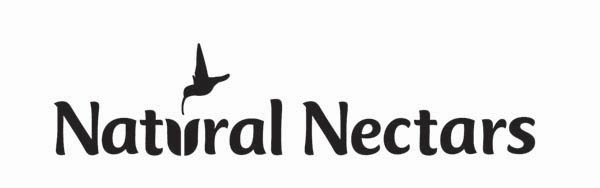

I think that the hummingbird drinking out of the letters is corny. It would look nicer if it was positioned horizontally or flying upwards slightly above the letters - giving it a "so free I'm about to fly away" feeling.
Also, the ct is not right, kerning plus c sloping differently from the other letters.
As for Nantucket Nectars "Real is Better", you've just got to wonder if they import their orange concentrate from Brazil like most other brands.

I love the hummingbird, but the typeface says Nestle especially the "N"
Thanks Yaply, Edvino.
would appriciate more feedback as I have one 'yes' and one 'no' for the humminbird...
I'm not keen on the hummingbird, but if you use it I think it should be stylised in the same way as the flower u. However, and this might just be because I'm a gardener, but the flower looks like a tulip. Not something likely to be visited by a hummingbird.
A problem I have with the hummingbird and flower idea is that it is taking the "nectar" part of the name too literally. This is a juice company. Nectar and juice are not the same thing although nectar is a well known metaphor for a sweet drink. Hence Nantucket Nectars, nectar of the gods, etc. Unless this company happens to be using flower nectars I'd try a direction that says juice & fruit rather than flowers and pollinators.
Sorry, I wasn't clear. I like the hummingbird too. It's a good symbol for nectar. I don't like the drinking out of the letters bit. That's corny. It would look better if it was just flying around - gives the idea of being free and natural.
Actually, I think that the company name would sound better as "Natural Nectar" rather than "Natural Nectars", it sounds more natural, but that's outside the scope of this forum.
okay.
good feedbacks; makes me think now... :)
thank you,
elsi
I just meant the name/product category, not the logo.
But hey, a Kennedy Fried Chicken is opening up in my neighborhood, so I'm probably wrong.
Anyone see Coming To America?
Captured from web.archive.org on 5 Aug 2014. view this capture