
Logotype for Pan Asian cuisine. Target demographic is women aged 15-55.
This is my first attempt at completely custom, "hand" lettered type. All comments welcomed!
Logotype for Pan Asian cuisine. Target demographic is women aged 15-55.
This is my first attempt at completely custom, "hand" lettered type. All comments welcomed!

Looks nice. Some suggestions would be to shorten the descender strokes on the g's. Thin the connecting stroke from the i to n and also try to put more slant on the bowls of your g's so the match the italic pitch of the n.
Other than that it looks very nice :)
Would love to hear some more comments on this one!

I would try to swap the two "g" one in the place of the other, because of that "swirl" of the first one (just a suggestion to try something different, i don't know how it will look like), shorthen the descenders and make the overall logo a liiiittle less bold: when set in white it looks too bold to me...

What about a capital G?
Here is the latest version. The client liked the first one but wanted to take a much more modern approach.
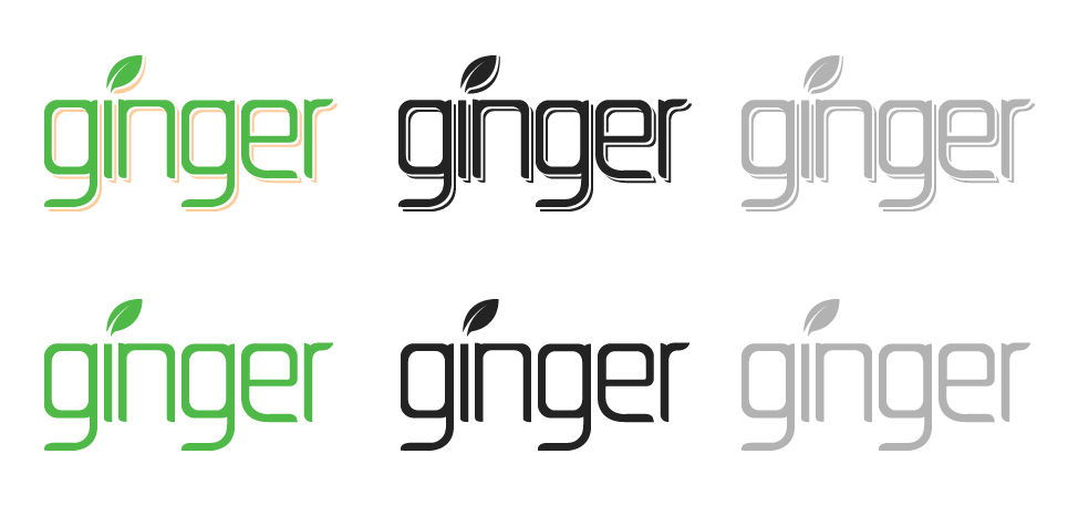

When I think of ginger, I think it's pretty organic--not in the fluid art nouveau line sense, but it does grow in a way that doesn't remind me of the latest stuff.
It's also textured and bumpy, and has rings along its root sort of like a bamboo stalk does.
Either way the client wants what they want--but I can imagine modern simplistic still being organic, instead of almost so industrial as to use the square as you have in the latest example...which is why I think the leaf seems like so much of an after thought (its forms don't at all correspond to the letters').

the latest version the leaf looks more like a flame. Also the type choice doesn't feel very welcoming...especially for a restaurant...too rigid. The original concept was much better.

i think your original concept felt much more modern as well as more playful and inviting.
just needed a couple small touch-ups.
Agree with Evan, the latest logo looks way more dated than the first one. This could evoke industrially mass produced ginger juice, or anything else. It gives me a cold "synthetic" feeling. Sorry to say, but for me it really lacks personality...or maybe it's just the client's taste.

Yes, this second version feels very 80s modern
Agreed. Was really digging the first version. The second has the feeling of a bottle of herbal tea. But, the client is the client. I would try and warm it up a bit, seems a bit cold at the moment.
Captured from commoncrawl.org on 26 Apr 2015. original URL