
I'm satisfied w/ the mark but I'm not sure which type would fit best out of the three I have chosen. The keywords for the artist are sexy, playful, and elegant.
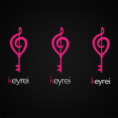
I'm looking for comments, suggestions, or just general feedback. Thanks!
I'm satisfied w/ the mark but I'm not sure which type would fit best out of the three I have chosen. The keywords for the artist are sexy, playful, and elegant.
I'm looking for comments, suggestions, or just general feedback. Thanks!

the first one is probably most charming and playful.
are you trying to make the type harmonize or contrast?
if the former, go a bit more organic in terms of letterform or their edges.
if the latter, well, the second one is going that direction.
not sure if the third is an entirely different font than the second, but it's weight looks nicer to me (and would DEF. look nicer if the type was in any other color than white).
also, i find the colored K unnecessarily distracting.
Thank you for the feedback, evanbrog. Here are three new ones. Do these work any better? I was going for a more organic typeface to harmonize w/ the mark. I also squashed the mark vertically a bit because I thought it looked more attractive.
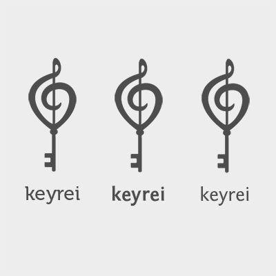
Of the new typeface choices I think the leftmost one is really cool. The serifs really mimic the way the key teeth attach to the rod in the mark.
It's a lovely mark.

Definitely an improvement. With the new color scheme I keep seeing an E in the negative space of the key teeth. Odd! Maybe it's just me. But I think the weight of the middle typeface and the style of the left one would be fab. Good work!
Thanks! Just out of curiosity, I compressed the mark a bit vertically the second time around. Do you guys think the first set is better or the second?
In the first version it's reasonably clear that the bottom of the clef spiral is meant to drop to a point. After compression, it looks more like an unskilled hand failed to make it round.

I like the mark on the first set.
I like the type of the left one on the second set, except that the Y and R are too close to one each other.
Captured from web.archive.org on 21 Aug 2013. view this capture