
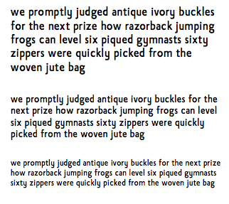
I am new to type design and would appreciate some feedback on my latest efforts. This typeface is intended for body text and small sizes.
| Attachment | Size |
|---|---|
| easysans.pdf | 15.57 KB |
| easysans2.pdf | 12.7 KB |
I am new to type design and would appreciate some feedback on my latest efforts. This typeface is intended for body text and small sizes.
| Attachment | Size |
|---|---|
| easysans.pdf | 15.57 KB |
| easysans2.pdf | 12.7 KB |

Looks like you have started off modifying Gill Sans and its influence is showing. But I am not very sure if the x-height, weight and counters are ideal for a text font in small sizes. Some letters espacially lowercase y looks out of place.
I see where a couple Gill Sans features popped into the design in the lowercase d and q (they are now a little different in my latest revision). This was not intentional, and I certainly was not modifying an existing outline. I tweaked the x-height and lowercase y as per your suggestions. Thank you very much for the feedback!
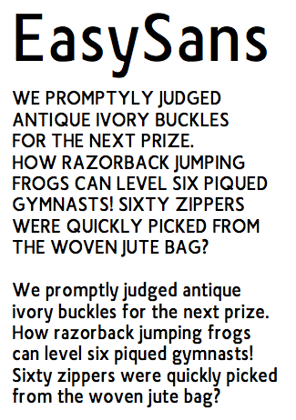
Attached is the latest revision.
For now, I will be adding glyphs and figuring out the whole kerning/metrics process. Any thoughts or suggestions would be welcome.
Captured from web.archive.org on 14 Apr 2015. view this capture