
How do you advise that in situations when a page set with the font you make (a typeface in which every letter, retail and proportion are your original assumption) look like set with an existing, well-known font?
How do you advise that in situations when a page set with the font you make (a typeface in which every letter, retail and proportion are your original assumption) look like set with an existing, well-known font?

Do you mean print or screen?
Print. And I mean the whole impression of a page. My font behaves like one of oldstyle serifs. I don't care of fools, but now - when I found the similarity - it's hard for me to introduce some further details (fine tuning), since I am affraid of making the similarity deeper.
So, both metrics and colour?
Similar colour and, hmm... similar angles?
Well, for one, the fine tuning could lessen the similarity.
And, said similarity could well be a selling point after all: there are lots of requests for fresher faces which are similar/compatible or have the same feeling of older ones.
Thank you.

Or you scrap the design and move on to something else. It happens.

You could change the colour by changing the rhythm of the verticals.
The important ratio is the vertical strokes in "i_n".
Either they are even, or the space inside n is larger/smaller than the space between glyphs.
So compare yours to the "classic" and do otherwise.
(Note this difference between Adobe Caslon and Caslon Old Face.)
You could also change x-height and cap height relative to ascenders.

It is just a fact that a certain combination of (design) characteristics is what makes a typeface an oldstyle serif… Change a few of these and it is going to be a ‘venetian’ or a ‘garalde’ or whatever…
There IS a market for a good oldstyle serif.
It's because I made the bowls rounder than I planned first, for better legibility at small sizes. Having that, I started to "pay to" these forms, changing existing features to fill the gaps.
I posted the thread, because when I saw a test printout on my desk, I first thought it was a page from one of articles on typography that probably had fallen down from the shelf ;)
I have prapared an image, but there is a problem with uploading today...
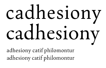

I don't see a problem here, as they are quite different in the details. I think you could make it even sharper in the details. I like it. There are a lot of oldstyle serifs around, but I think a more modern sharp interpretation does fill a gap, as far as I know. Lots of typefaces look simular when set in small sizes, but are quite different when looking at the details. I think the image above does not give a correct picture of how it will look in hires print, as the details (and thus the differences) will be much more visible.
Captured from web.archive.org on 24 Aug 2013. view this capture