Typophile

Magazine Headline Sans

papaleo

Hey guys,

I`m developing a font for an education magazine for my final university project. This is my first time making a font, so I would be very happy if you could give me some feedback. It`s a sans serif for headlines, and still with no name (taking suggestions). The kerning and metrics aren`t done yet. I recommend the PDF for better view.

Thanks a lot!
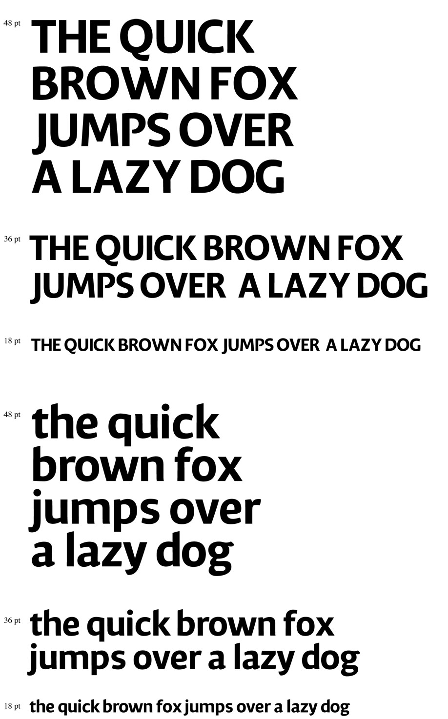
AttachmentSize
especimen_curvas_papaleo.pdf382.66 KB

David, this is great stuff! You obviously have great talent for type design, my compliments (as one amateur to another).

A few remarks:
/m/ looks a little too wide
/S/ and /s/ look a little too wide and tilted to the left
upper bowl of /S/ and /s/ could be narrower (looks upsidedown)
/N/ could use more contrast (make verticals narrower and diagonal fatter)

You say this is for headlines so I understand is quite bold, but I'd really like to see a regular version! Can't wait for the numerals either!

Keep going!

This is really really charming. I like the slight assymetry to the counters and the caps are very strong. A few little things:
The /a/ counter seems a little squarish when compared to the /q/ and /d/.
The /z/ is heavier than the other lowercase letters, maybe thin the diagonal?
There seems to be some inconsistency in your corners, some are rounded like the bottom most corners of the /c/ and /e/ and whereas most end in points.
I agree with Jean Paul that the /s/ and /S/ are top heavy and lean to the left.

Despite that nitpicking, it's a very good design and I'm interested in seeing how it develops.

jrl

Thanks a lot for the comments Jean Paul and Doc! Really aprecciate it.

I`ll make some changes today based on your comments and send again so you see if it`s better.

Paul, I plan on doing a regular and light weight, and maybe a text version as well.

Thanks again, and good day to you!

Neat stuff. I'll have a closer look and get back to you with crit in a couple of weeks hopefully.

What a strong first go.

The P calls rather a lot of attention to itself. It may be a "murder your darlings" situation. If you won't close it, maybe at least it shouldn't taper quite so much.

The diagonal of capital Z is also a bit heavy.

This is really funky, lowercase is especially charming.

Q has just poked me in the eye — its tail.
Ss is falling backwards a bit.
u may benefit from a couple of units narrowing.
Ear of g is singing a different tune (angle of terminal).
Word space looks a bit narrow.
R may be too narrow. Bowl could be larger.
Counter of A could have a higher apex to avoid dark spot.
Crossbar of F is usually a notch lower than on E.
Contrast on stems of U could balance more.
Head of t looks dark.
Acute accents need better positioning. a needs further left, u further right.

Is this a bold/semibold weight?

This looks really funky indeed!
Apart from everything above, here's what I see:
IMO vwxz could use a bit more funkyness. Try curving them a bit (more).
e seems too wide
c also too wide
o too small

Hope this helps. Good luck.

sorry. edit: e looks too SMALL. not wide.

I think Jasper means narrow, not small. In Dutch 'smal' means 'lean, narrow'.

Yes your right Jean Paul, thanks for correcting me.

Captured from web.archive.org on 17 Apr 2015. view this capture