
I just starting playing around with the word Iota by incorporating the actual greek alphabet iota into the word eyeota. Any thoughts? I know it's a pretty simple (and maybe too obvious) solution. The font used is Lobster 1.4 by Pablo Impallari.
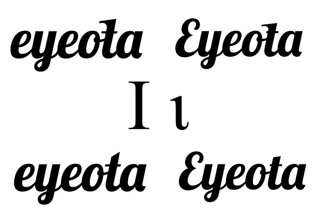
I just starting playing around with the word Iota by incorporating the actual greek alphabet iota into the word eyeota. Any thoughts? I know it's a pretty simple (and maybe too obvious) solution. The font used is Lobster 1.4 by Pablo Impallari.

I like the one on the bottom left the best, though it loses any translation of the concept of the iota. I think to improve it for the top left one, make the head of the iota more simler to the example you have in the middle, though I think the curvature at the bottom of the t may make it really hard to show off the iota concept.
Sorry I didn't clarify, the bottom left is the original Lobster font. I guess that somewhat answers my question though.... So thanks.
Captured from web.archive.org on 20 Aug 2013. view this capture