Typophile

Feedback please - Typographic cover design

akos.polgardi

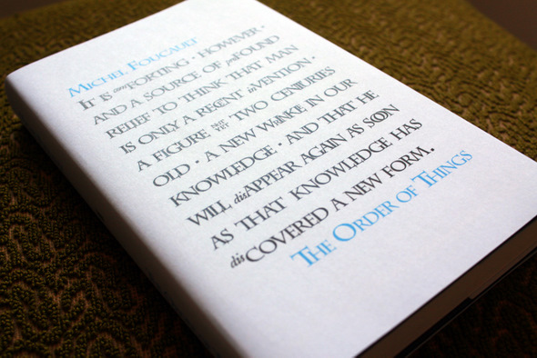
Inspired by David Pearson's (and Phil Baines' etc.) designs for Penguin's Great Ideas series and a recent re-reading of parts of The Order of Things I put together a preliminary cover design for Foucault's book. I'll try to make some test prints tomorrow so I thought I'd ask what people around here think about it. The project is intended purely for my fun and the annoyance of friends I keep showing it to.
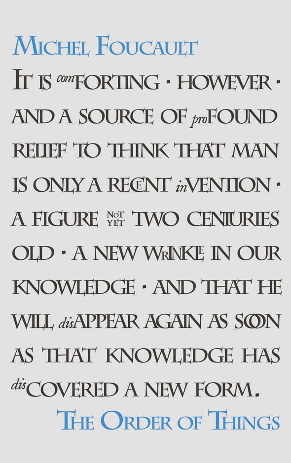
I think you need to ask yourself what is the purpose of subcapping and shrinking the first three letters before some of the words--for me, the concept fell flat. Moreover, the "not yet" to me struck out as reminiscent of the Harry Potter font.

Thanks for your comment. You're right about the HP font, I haven't noticed that.
The idea behind setting (some of) the Latin prefixes in sub/superscript lowercase was mainly just space management. I wanted the text to look uneven partly because of the 'wrinkledness', referred to in the quote, and partly because a large part of the book is about the impossibility of classification, i.e. of subsuming particular instances under a general concept (or in this case, of forcing text or language into a strict grid).

It could work. But either I would research more on the style of abbreviations of olde (which, perhaps isn't so appropriated given the author and the matter)*, or spend some more time trying to use them in order to highlight the most relevant parts of the quotation.

* Then, again, it could be appropriated in showing some sort of "wrinkle" which already disappeared.

Thanks for your comment. The original idea was actually to follow your second suggestion but sadly I ran out of ideas after 'wrinkle'. Another plan was to focus typographically on 'man' (who is after all the hero of the sentence) and then gradually 'fade out' toward the end of the quote. In the end I abandoned that one because it would look too similar to Chip Kidd's The Original Of Laura cover.
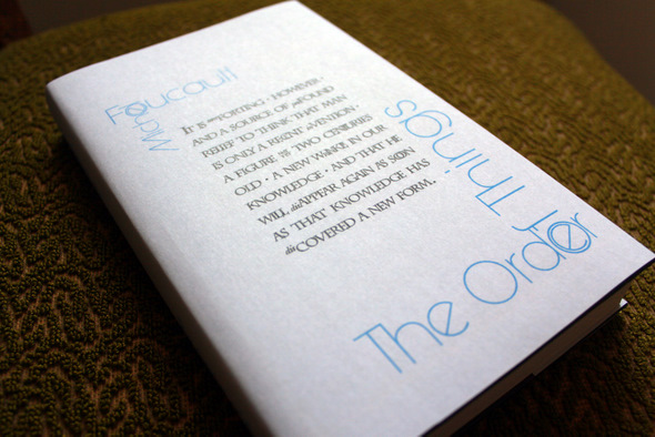
I attach picures of a slightly modified version of the original as it looks printed, and a typographically rather different approach.


I’m not sure this second one works…

I’m not sure this second one works…
I know what you mean.

Captured from web.archive.org on 24 Jul 2014. view this capture