Hello,
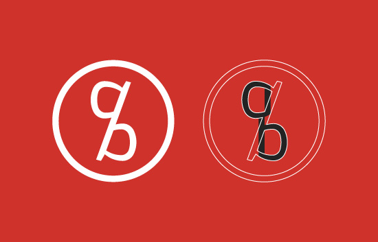
I'm in the process of creating my own visual identity and am looking for any advice on how to proceed. Let me explain the project briefly. I've settled on a word mark built around an ambigram of my initials, A,B. The ambigram will serve as a watermark for my illustration work and acts as a distinct element - i'm not planning on keeping the wordmark and ambigram together in the final layout.
The ambigram is meant to resemble a percentage mark by joining the letter 'a' on top of the 'b'. The forward slash though is only at a 15 degree angle, so I'm wondering if it's enough to make it look like a percentage mark, not just a unified a+b.
The final ambigram also determines the layout of the wordmark (see image "3"). The positioning of the "a" and "b" from the ambigram corresponds with the initials from the wordmark. I wanted to preserve the resemblance between the two elements as much as possible, but perhaps it only creates an unbalanced wordmark?
So here are my questions. Does the wordmark look unbalanced? Are there any other layouts I should try (keep both words side by side seems a bit long to me and left alignement may be difficult since i have an "a" and "b" to align).
Also at a first glance, does the ambigram resemble a percentage mark?
Any advice is welcomed, related or non related to the questions above. The font is made from scratch.
EDIT: Feel free to critique my letterforms, kerning etc.
| Attachment | Size |
|---|---|
| 1.jpg | 127.85 KB |
| 2.jpg | 115.56 KB |
| 3.jpg | 85.31 KB |