
This looks very odd to me and I'd like an expert opinion on exactly what is wrong. I'm not great at recognising serif faces but I think the lower-case is a Caslon or perhaps a Garamond. However the upper-case seems to be a different face & possibly manually slanted rather than a true italic. The weight is a bit heavier.
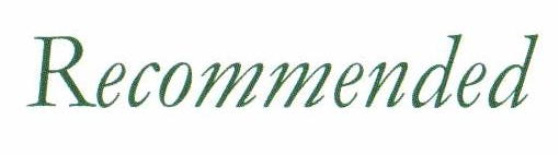
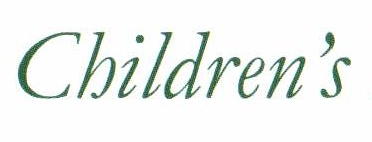
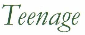

The more I look at it I wonder if the lower-case is a mixture or has been tweaked in some way too. The angle of the ascenders of l and d in "Children's" is a bit different.

