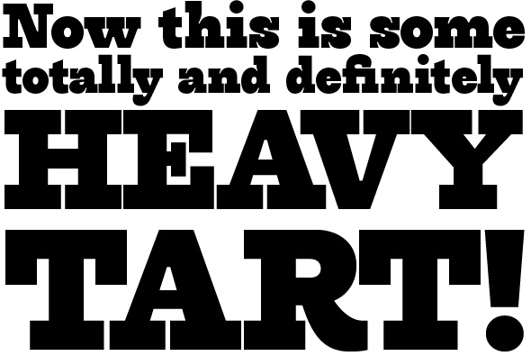
This is what happens, when a type designer has a whole weeks worth of vacation; I read a book set with (on/in?) Melior. And that was agony: glyph cotrast was way too high, and that squarish design did not help. So, I promptly went to work with a more legible replacement, and came up with utterly different font with nothing to do with Melior whatsoever:
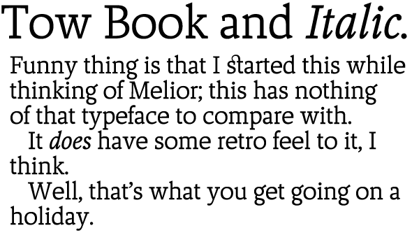
What do you think?
| Attachment | Size |
|---|---|
| Tow-sample.pdf | 441.85 KB |