
I'm having one dilemma.
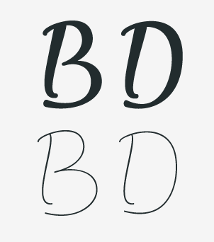
Do you find that those "B" and "D" are readable or non-readable?
Does they look to you more like some ligatures or recognizable letters "B" and "D" ?
Thanks.
I'm having one dilemma.
Do you find that those "B" and "D" are readable or non-readable?
Does they look to you more like some ligatures or recognizable letters "B" and "D" ?
Thanks.

B looks like 13, specially on the light weight.
D looks like D
Thanks Pablo.
Back on thinking.

I think it looks like a B, but it’s very much dependent on the context.
This is one old sketch done very quickly then, so there are a lot irregularities in overall layout and whole concept.
A couple of people told me that /B/ and /D/ would look very strange and not enough recognizable as those letters. So that started bugging me more and more.
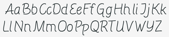

I think it’s the right-pointing lower terminal (also seen in b) which appears problematic.

What Frode said.
Have you tried having the bottom-left corner of those two characters just as a single curve? (ie, not separate strokes; keeping that characteristic curl at the foot, but then running straight on into the bowl?)
Captured from web.archive.org on 19 Apr 2015. view this capture