
Hey guys,
Bit of a nightmare this one. Existing identity that we are tweaking. Sabon Next Small caps. Does the kerning look right to you?
Thanks in advance!
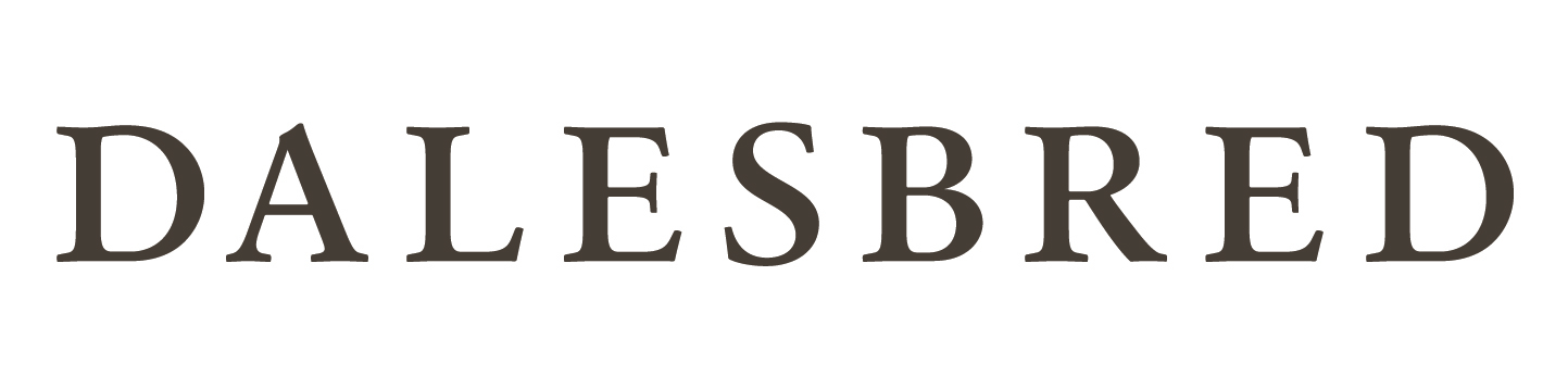
Hey guys,
Bit of a nightmare this one. Existing identity that we are tweaking. Sabon Next Small caps. Does the kerning look right to you?
Thanks in advance!

My proposal here :)
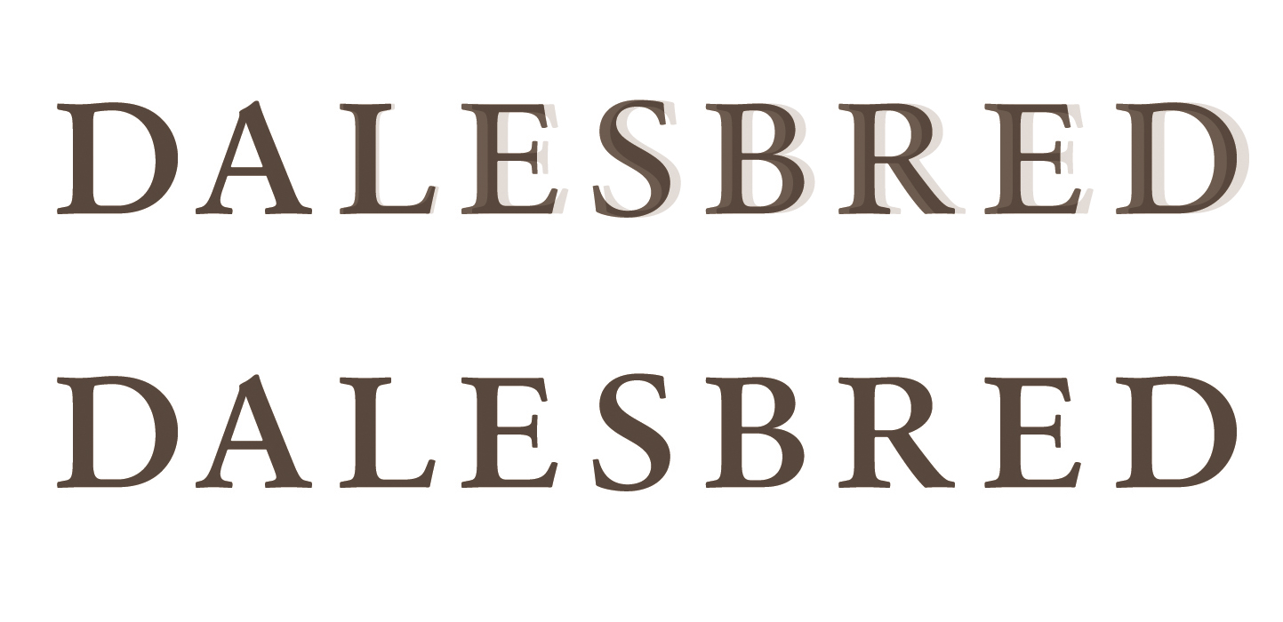

I think tampas' proposal is better.
Captured from web.archive.org on 19 Apr 2015. view this capture