

Any idea what this may be? All the variations of this style that I have digitally don’t match exactly. (Century Schoolbook, Madison, Century Expanded ...)
Any idea what this may be? All the variations of this style that I have digitally don’t match exactly. (Century Schoolbook, Madison, Century Expanded ...)

Hi Jens -
It's certainly some kind of slight variation on Century Schoolbook. I think that due to the fact that the printing surface is presenting with some bleeding, the letterforms are distorted somewhat. The closest I can find to your sample (going primarily by the serifs on the W) is Monotype's version.
http://new.myfonts.com/fonts/agfa/century-schoolbook/
If this isn't to your liking, type "Century Schoolbook" into the search engine at MyFonts; there's a lot of versions available, with subtle differences.
-NJ

I assume Jens is not looking for a close digital match, but for an actual ID – no?
Of course, but he says that "All the variations of this style that I have digitally don’t match exactly". I was just offering a theory as to why that may be.

Note that the initial "Wi" is kerned; this matches the available "two-letter logotypes" for Linotype Century Expanded.
Florian is right, I'm just interested in what font this is. I don't have any old specimen books to consult ...
The sample is from a custom-printed birth announcement card from 1970. I don't know if hand-composing was common for this kind of printig job then ...
The g is notably different from all the Century variations.
It might be Linotype Excelsior, or not; how about some more characters?
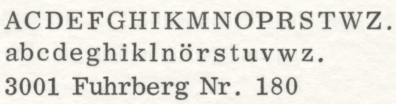
This is the alphabet, as complete as possible from my source.
Well, it's definitely NOT Excelsior, but I am still certain that it IS a Linotype face...

Ionic No 5 by Merghenthaler Linotype?

> Ionic No 5 by Merghenthaler Linotype?
Ionic No. 5 seems to fit.
See page 19 of the following document:

The caps don’t match.

Given its roundness, I’d check the different versions of Bauer and Baum’s Impressum. Some are quite close (the r differs in some versions).
Clarion is close as well. But as we all know, close is the little sister of futile.
^ Hmm, today I wonder what led me to the assertion that this typeface is close to Impressum…
Any new insights yet?
Captured from web.archive.org on 24 Jul 2014. view this capture