
Hi everybody
I've been working on a new sans(and a new serif).
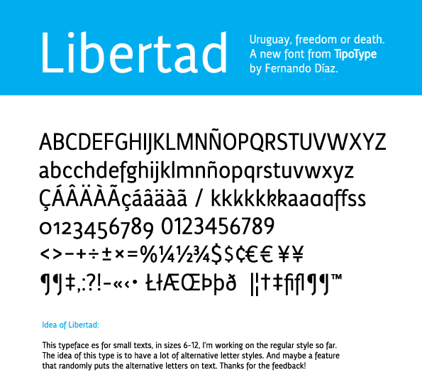
Recieving feedback!.
Best regards and thanks!
(También hablo español,
cualquier cosa a las órdenes)
| Attachment | Size |
|---|---|
| LibertadSample.pdf | 713.68 KB |
Hi everybody
I've been working on a new sans(and a new serif).
Recieving feedback!.
Best regards and thanks!
(También hablo español,
cualquier cosa a las órdenes)
| Attachment | Size |
|---|---|
| LibertadSample.pdf | 713.68 KB |

Overall looks really good, but from the start, your acute and grave accents look too horisontal; I was thaught that they should fly off the tangent of 'o', but yours seem to hover over them. And your standard 4 looks wider than other numerals. And I would go with vertical stems with Æ and Œ; Scandinavians like that sort of things.
Readability and leigibility are very good, so good stuff!
Hi Tomi!
Thank for the feedback, the accents are very horizontal becouse it's how we use them on spanish, but, I could do both! It's not a bad idea.
About the Æ and Œ, tell me more!
The ones i've made are not very accepted?
Best regards.
My teacher was French, so that could be the difference. Æ and Œ are mainly used today in Scandinavia, so they know the best practice, as you can see from that previous post by Riccardo.
Thank you both,
Will do them correctly in the next version, i've allways wanted to know that!

Who's using Πin Scandinavia, Tomi? Didn't the vikings get rid of that stuff around year 1300?
Oøœps, sorry. Æ is still in use. We Finns just never learn…
Norwegian newspapers never learn :) They still mistype œ for æ every-now-and-then.

The lowercase "r" seems a bit narrow to me, given that the typeface is intended for small sizes.
Cheers,
T
Thanks Thomas,
Will fix that,
I often read your blog! :)

I think a descending /f/ can work, but to my eye yours descends a little too much.
@eliason
You think? The desends are too low in general or only in the "f"?
Regards

Hola Fernando. Well, it seems that sans projects always receive much more contributions than serif ones. My two cents:
01: about acute, what I told about Fénix applies here too. But I must add that Libertad acute has a wonderful shape, really handsome.
02: I like your f descender, but I believe it needs the same bottom cut as thorn descender.
03: your alternates for a and k are insightful and welcome, especially the 5th k and the 4th a. I don't like alternate s because its curves seem to be irregular –and so it does not fit to font overall regularity.
04: very nice numbers! I guess oldstyle 6 and 9 will work better with a somewhat bigger "o" to compensate the area "lost" due to out-of-lining arcs. Some test besides other oldstyle numbers would confirm or not my impression. Anyway, I don't like 5 vertical stem. It makes the glyph appear a bit inclined towards left. Maybe a small inclination in the stem solves this.
05: W could be a bit narrowed.
06: as it's intended to small sizes, comma and apostrophe may benefit with a stronger tail.
07: I second Thomas opinion about r.
I like very much general text effect. Very clear, regular and legible. Glyphs d, p, q, h, m, n and g are perfect. I surely would use it with alternate a #4.
Keep the great work.
@ Freiberger
I'll have this into consideration
Thanks for the comments! :)
I've posted some comments on your typeface!
Only in the /f/.

Apologies for coming back to Œ; I wanted to point out that it is still in use in France, as in "Fondation de l'Œuvre Notre Dame" (http://www.oeuvre-notre-dame.org/index2.htm), "Œdipe" (http://fr.wikipedia.org/wiki/%C5%92dipe), "L’Œil de la Médiathèque" (http://veille.ircam.fr/), and so on.

I recently saw an old german book that use the Œ to write GŒTHE instead of GOETHE. Surely here it was used as an (unintended?) decorative ligature...?
Captured from web.archive.org on 14 Apr 2015. view this capture
