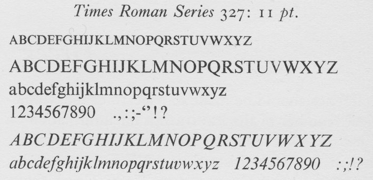
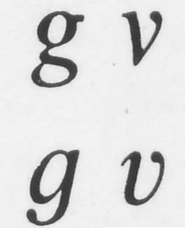
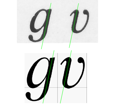
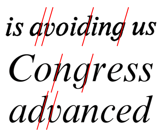
Some weeks ago, I stumbled upon a variant of Stanley Morison’s Times in which several characters of the italic cut differ from what nowadays is usually seen in this typeface. Have a look:
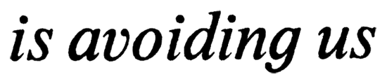
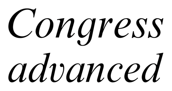
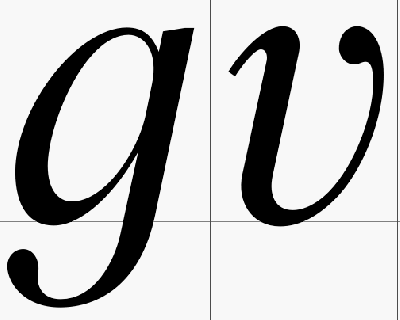
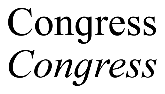
Lowercase ‘v’ and ‘g’ differ noticeably from the standard TNR, shown below:
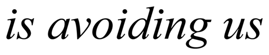
Unfortunately, I don’t exactly recall from which book I took the above snapshot. I reckon that it might have been a non-fiction volume from the 1970s, printed probably in the USA. What I do remember is that the colophon stated that the book was “set in Monotype Times Roman”. This information, however, has not led me very far.
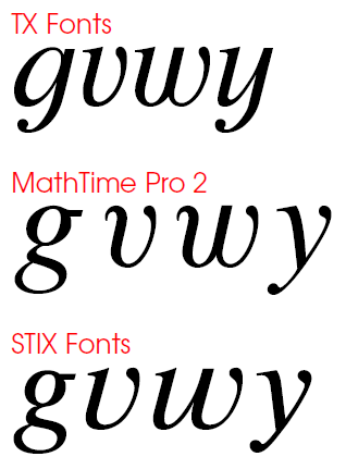
Can you tell me something about the provenance of this mutation? Has it been used in Europe as well as in the States? Is there any relation between these character shapes and Morison’s original drawings? And finally: Is there any digitised Times featuring a two-storey ‘g’?
P.S.: I know this isn’t precisely a type ID, but this board is where I hope to meet the detectives among you. Thanks in advance!