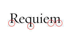
My employer uses HTF Requiem as the standard typeface in print and identity. It is a great face and a broad family for many applications. Unfortunately, it doesn't seem to have ligatures for the text weights, except for italics. Am I wrong? Am I just missing something?
Also, a lot of my work is for the web. Requiem's fine serifs often breakdown when they are exported in images. Any suggestions on dealing with this issue? Alternate, comparable typefaces?