Hello fellow Typophiles
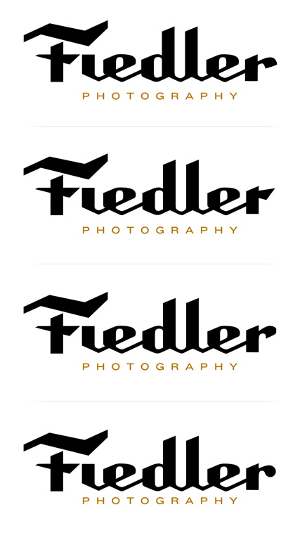
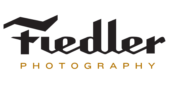
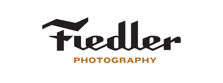
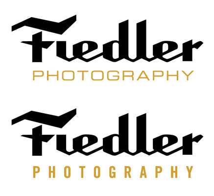
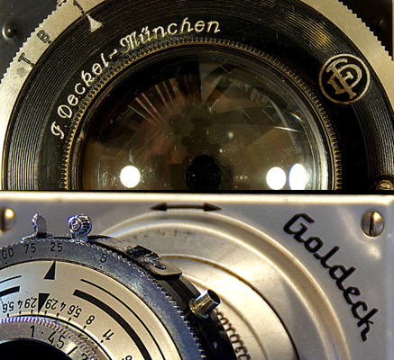
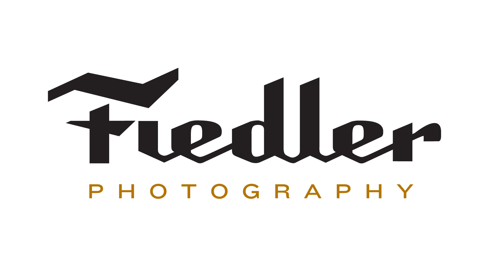
Below is an identity I created for a close friend and photographer. Inspired by the script identities of Leitz / Leica and other bygone camera manufacturers, I took the approach of combining a friendly script with mechanical germanic flair. As a photographer both relies on his personality and his technical skill to create images this dichotomy made sense to me.
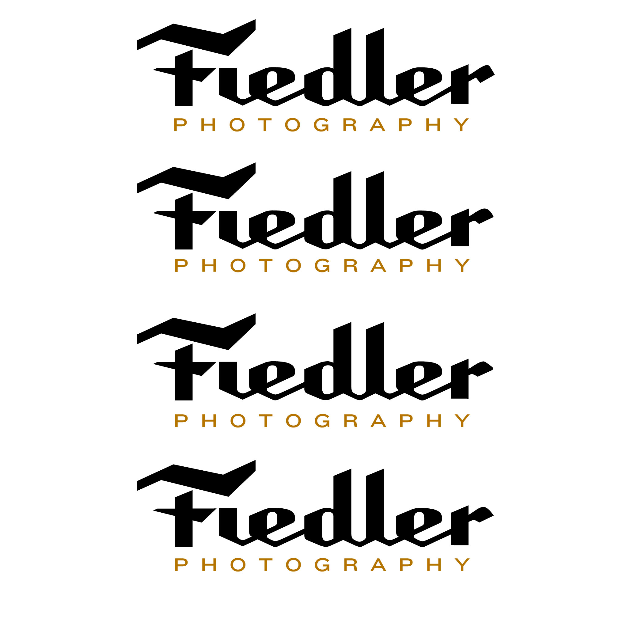
I was wondering what sort of feedback you guys had? I have already combed it over a few times fixing some quirks that I had - especially with the d and r. This is what i ended on - but i feel like you guys could definitely help me find the best solution.
Also shown is a 'logo' - to be used as a watermark on his photographs. I originally had the F within a circle as it related to a cameras lens, but settled upon this shape as it was far more proprietary and memorable and fit with the quirky rigidity of the logotype.
Thank You

Higher Res Images are attached
| Attachment | Size |
|---|---|
| Fiedler_01.jpg | 63.48 KB |
| Fiedler_Logo_01.jpg | 18.56 KB |
| Fiedler_5.jpg | 175.06 KB |